Generative AI and Data Visualization
This lesson sits at the intersection of two skills that every business analyst needs: knowing how to use generative AI responsibly, and knowing how to communicate data honestly through visualization. The AI concepts you built in the first lesson of this course — what generative AI is, how it differs from predictive AI, the four analytics categories, hallucination warning signs, and the three prompting strategies — are applied here to their most important practical output: data visualizations.
We begin with generative AI applied to visualization — taking the hallucination warning signs and prompt engineering toolkit you already know and focusing them specifically on chart output. The failure modes are the same; what changes is where to look for them.
We then move to data visualization principles: the perceptual science behind why some charts communicate and others mislead, the aesthetic channels through which data is encoded, the taxonomy of visualization failures (Good, Ugly, Bad, Wrong), seven reasoning errors that show up in real-world charts, and the relationship between correlation and causation. These concepts apply directly to every chart AI generates for you.
The lesson closes with the Kaiser Fung Trifecta Checkup — a three-corner framework for evaluating any data visualization on question quality, data quality, and visual execution — applied as a hands-on activity in which you use AI to build a chart and then critique it systematically. The activity is designed to make the limits of AI concrete: AI almost always passes the visual corner by default; the question and data corners require your statistical judgment.
At a Glance
- This lesson applies two threads you have been building all semester: using AI as a tool, and communicating data honestly. The AI concepts from the first lesson — hallucinations, prompt strategies, the handles/requires-judgment division — are applied here to visualization, the output type you have been producing all semester. Pay close attention to how the Trifecta Checkup formalizes the analytical judgment you have been exercising informally since the first lesson.
Lesson Objectives
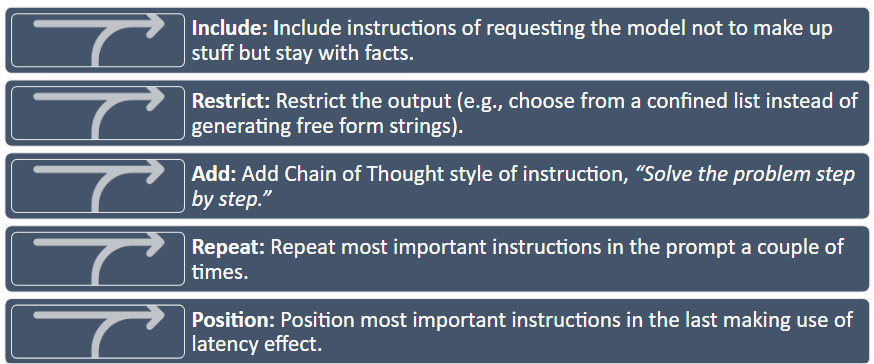
- Apply LLM mechanics and hallucination warning signs specifically to chart output.
- Write effective prompts for data visualization tasks using zero-shot, few-shot, and chain-of-thought techniques.
- Describe the six visual aesthetics and identify which is most perceptually precise.
- Apply Wilke’s Good/Ugly/Bad/Wrong taxonomy to classify a visualization failure.
- Identify at least four of the seven reasoning errors in a real data graphic.
- Apply the correlation vs. causation distinction — covered in the ANOVA lesson — specifically to chart titles, annotations, and AI-generated interpretation language.
- Apply the Kaiser Fung Trifecta Checkup to evaluate an AI-generated visualization.
Consider While Reading
- In the AI section, the focus is not on re-teaching how LLMs work — you covered that in the first lesson. Focus instead on how the same warning signs and judgment calls translate when the output is a chart rather than code or text. The failure modes are identical; the surface they appear on is different.
- In the visualization section, notice that every pitfall has an underlying perceptual or logical mechanism. Understanding why a chart misleads is more useful than memorizing a list of rules — it lets you catch problems in novel situations the rules do not cover.
- The Kaiser Fung activity is deliberately structured so that the AI will make at least one mistake worth catching. The goal is not to produce a perfect chart; it is to practice the diagnostic thinking that turns chart generation into a chart argument.
Generative AI in a Business Analytics Context
The four analytics categories (Descriptive → Diagnostic → Predictive → Prescriptive) were introduced in the first lesson of this course and have been the organizing framework for the entire semester. By this point, you have worked across all four: descriptive statistics and data prep covered the first category; correlation and ANOVA addressed the second; regression addressed the third. AI has been a tool throughout — accelerating mechanical execution at each stage while you supplied the question, the data, and the judgment.
This lesson focuses on one output that AI generates at every stage: visualizations. A chart is the most common deliverable in a business analytics workflow, and it is also where AI fails most characteristically — passing visual execution while missing the question and data quality that make a chart analytically honest. The Trifecta Checkup you will apply in the activity formalizes the Q–D–V framework that has run implicitly through every prior chapter.
| AI handles well | Requires your judgment |
|---|---|
| Writing and editing code syntax | Verifying that the code answers your question |
| Generating chart boilerplate | Evaluating whether the chart is analytically honest |
| Summarizing text and documents | Checking whether the summary is accurate |
| Explaining statistical concepts | Deciding whether the explanation applies to your context |
| Formatting and structuring output | Determining whether the structure serves your audience |
| Arithmetic in simple expressions | Any multi-step calculation (AI approximates, not computes) |
This table maps directly to Kaiser Fung’s Trifecta: AI handles the V corner (visual execution) reliably. The Q (question) and D (data) corners require you.
Hallucinations in a Visualization Context
You covered the five hallucination warning signs in the first lesson. Here they take on specific, consequential forms when the output is a chart:
| Warning sign | In a chart context |
|---|---|
| Unverified specificity | Exact percentages or statistics in chart labels without a traceable source |
| Invented sources | Dataset names or variable descriptions that do not match your actual data |
| Internal contradictions | Chart title claims one thing, data pattern shows another |
| Overconfident language | Interpretation comment says “X causes Y” when only correlation exists |
| Failures of common sense | Values outside a plausible range, proportions that do not sum to 100% |
Practical rule: always run AI-generated chart code yourself and verify that the data being plotted is the data you intended. Never submit a visualization you have not executed, checked, and interpreted.
Data Visualization Principles
With AI established as a tool and its limits understood, we now turn to the output that AI most commonly produces in a business analytics context: data visualizations. A chart generated in seconds by AI is only as good as the statistical and perceptual principles behind its design choices. This section builds the vocabulary to evaluate, improve, and — when necessary — reject AI-generated visualizations.
Why Good Research Methods Matter
Wilke (2019) argues that data visualization combines art and science. A visualization must accurately represent the data and be visually interpretable. These two requirements pull in different directions: overemphasis on design can obscure statistical honesty; overemphasis on accuracy can produce charts that nobody reads.
The purpose of the analysis shapes every design decision. Four analytical purposes demand different visualization strategies:
| Purpose | What you are trying to show | Example |
|---|---|---|
| Describe | Trends, patterns, distributions in data | Bar chart of weekly active users by feature |
| Predict | Forecasted values or expected outcomes | Line chart projecting next quarter’s sales |
| Explain | Causal or comparative relationships | Side-by-side chart with control vs. treatment groups |
| Understand | Contextual, layered patterns | Dashboard combining time, geography, and segment |
Before building any chart, know which purpose you are serving. An explanatory chart that is mistaken for a descriptive one will be misread every time. 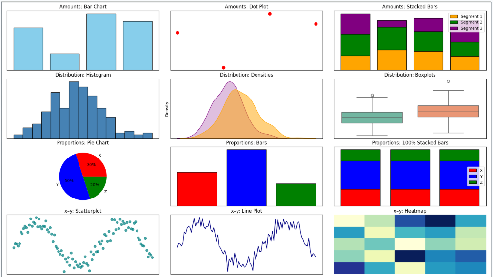
Aesthetics and Types of Data
Aesthetics are the perceptual channels through which data values are communicated to the viewer. Choosing the right aesthetic for the data type is one of the most consequential design decisions.
| Aesthetic | Best for | Example |
|---|---|---|
| Position | Any data; most precise | Scatter plot, bar chart — humans judge position better than any other property |
| Color (hue) | Categorical groups, highlights | Distinct colors for product lines or customer segments |
| Color (value/saturation) | Continuous quantities | Light-to-dark scale for income or temperature |
| Size | Magnitude | Bubble chart where circle area represents population |
| Shape | Categorical groups (especially when color is unavailable) | Circles, squares, triangles for group membership |
| Line width / type | Categories or values in line charts | Solid vs. dashed to distinguish forecast from actuals |
Position is the most perceptually precise aesthetic. Humans judge spatial position along a shared axis more accurately than any other visual property. When precision matters — and it usually does in business analytics — encode the key variable on a position axis. 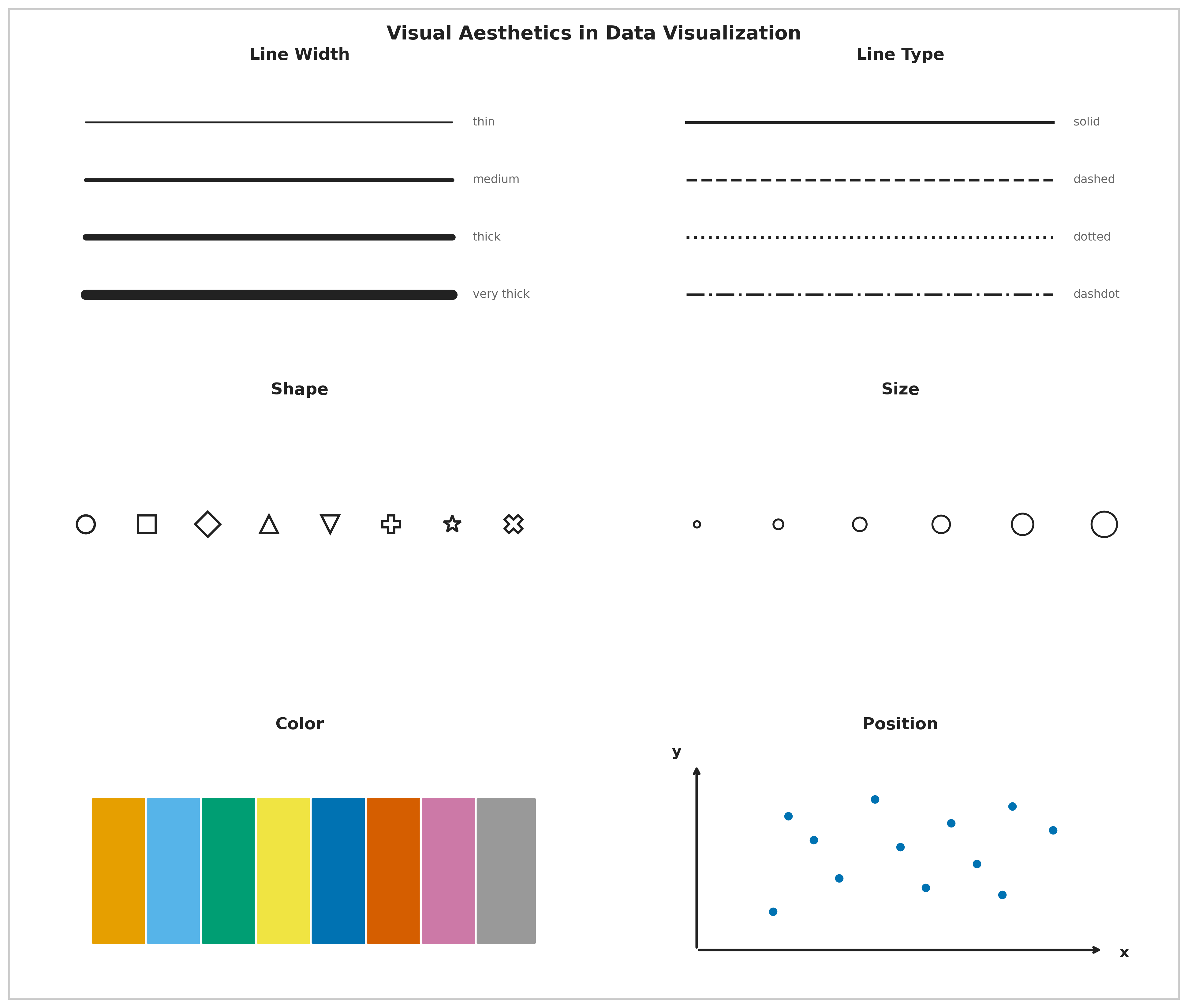
Color in Data Visualization
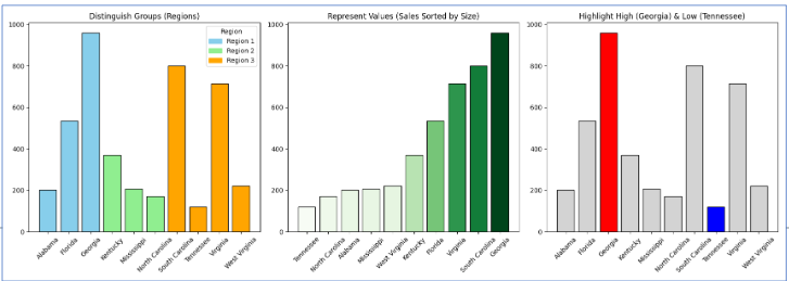
Color serves three distinct purposes, and confusing them is one of the most common visualization errors:
| Purpose | When to use | Example |
|---|---|---|
| Distinguish categories | Unordered nominal groups | Five brand colors in a market share chart |
| Represent values | Ordered quantitative data | Light-to-dark for income by ZIP code |
| Highlight | Drawing attention to one key element | One red bar in a chart of gray bars |
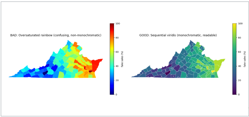
Each purpose implies a different type of color scale. Using a multi-hue rainbow scale (designed for categories) to represent continuous data distorts perception — the viewer’s eye assigns arbitrary importance to the color boundaries. Using a monochromatic scale for categorical data makes groups hard to distinguish.
Four color pitfalls to avoid:
| Pitfall | What goes wrong | Fix |
|---|---|---|
| Too many categories | More than ~6 distinct hues overwhelm memory | Consolidate categories or use direct labels |
| Decorative color | Colors that encode no information distract attention | Use gray as the default; add color only when it means something |
| Misleading scales | Rainbow or nonmonotonic scales distort value differences | Use sequential (light-to-dark) scales for ordered data |
| Color-vision deficiency | ~8% of men cannot distinguish red and green | Test your palette; use shape or position as a redundant cue |
A monochromatic scale (varying shades of one hue) encodes a single ordered dimension honestly — darker reads as “more.” A non-monochromatic scale (multiple hues) is better for distinguishing unordered categories where no shade should appear more prominent than another.
Evaluating Visualization Quality: Good, Ugly, Bad, Wrong
Wilke (2019) provides a four-category taxonomy for diagnosing visualization quality. These categories are mutually exclusive and cover every type of failure.
| Category | What it means | Example |
|---|---|---|
| Good | Clear, accurate, honest — aesthetic choices serve the data | Well-labeled bar chart with proportional y-axis |
| Ugly | Aesthetic flaws, but otherwise correct and interpretable | Valid chart with poor font choices or clashing colors |
| Bad | Perceptually misleading — unclear, confusing, or accidentally distorted | Truncated y-axis that makes a 2% change look like a 200% change |
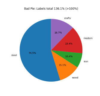
| Wrong | Mathematically or factually incorrect | Pie chart whose slices sum to 112% |
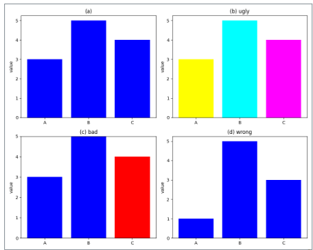
The taxonomy matters because the fix is different for each category. An ugly chart needs a designer; a bad chart needs a statistician; a wrong chart needs a correction before anyone sees it.
Wrong example — Pie chart: This chart combines two overlapping variables. Because categories are not mutually exclusive, the slices sum to more than 100% — making it mathematically invalid.
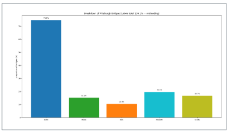
Bad example — Bar chart of the same data: The bar chart avoids the arithmetic error but is still bad — it hides the overlap between variables and leaves their relationship invisible.
Note on AI-generated charts: AI almost never produces wrong charts (arithmetic is rarely the failure) but frequently produces bad ones — particularly truncated axes and misleading aggregations — because it optimizes for visual plausibility rather than statistical honesty.
Seven Reasoning Errors in Data Visualization
Schmidt et al. (2023) examined 9,958 Twitter posts containing COVID-19 data visualizations and identified seven reasoning errors that recurred across real-world misleading charts. These errors are not hypothetical — they appeared in charts shared by journalists, public officials, and ordinary people during a high-stakes public health crisis.
| Error | What it means | Quick example |
|---|---|---|
| Misreading charts | Wrong conclusions from visual distortions or misread axes | Reading a log-scale chart as if it were linear |
| Cherry-picking | Selecting only data points that support the desired conclusion | Showing stock performance only from the trough to the peak |
| Arbitrary thresholds | Benchmarks chosen without principled justification | Drawing a “danger line” at 100 because it is a round number |
| Data quality issues | Using incomplete or inconsistent data without disclosing limitations | Reporting case counts that reflect testing rates, not infection rates |
| Ignoring statistical nuance | Presenting averages that hide meaningful subgroup variation | Reporting a drug’s average effect without noting it worked only in one age group |
| Misrepresenting scientific research | Oversimplifying or cherry-picking study findings | “Coffee prevents cancer” from one observational study |
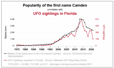
| False causal claims | Inferring causation from correlation without experimental support | Concluding from a time-series overlap that A causes B |
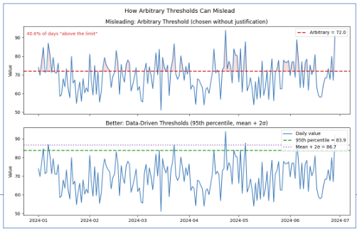
Arbitrary Thresholds
An arbitrary threshold is a benchmark chosen without clear justification — either as a specific number or as a visual marker on a chart — used to make a pattern appear significant when no objective threshold exists. Example: drawing a horizontal line at 100 to imply that values below it represent “failure,” when 100 was chosen for convenience rather than any analytical reason.
False Causal Claims
A false causal claim occurs when someone interprets a visual pattern or correlation as evidence of cause and effect without experimental or statistical support. Cherry-picking exacerbates the problem — selecting only data that fits a desired story makes the misleading pattern look more convincing.
Misreading Charts: Aspect Ratio and Coordinate Systems
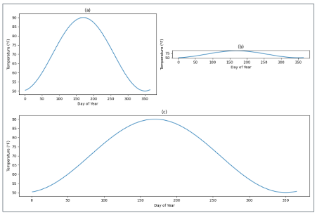
The same data can tell completely different stories depending on how the chart is sized. A line chart that is very wide and short (10:1 aspect ratio) makes slopes appear flat — “gradual, steady change.” The same data in a tall, narrow chart (1:2) makes slopes appear steep — “rapid, dramatic change.” Neither is mathematically wrong, but both shape the conclusion the viewer draws.
Wilke recommends the banking to 45° principle: choose the aspect ratio so that the average slope of the lines in the chart is approximately 45 degrees. This gives the most neutral visual impression of the rate of change.
A truncated y-axis is the most common bad-chart pattern in business reporting. Cutting the y-axis at 94,000 instead of 0 on a chart showing visits from 94,000 to 98,000 makes a 4% change look like a near-vertical spike. For bar charts, this is never acceptable — bar height encodes magnitude relative to zero, and truncating the axis misrepresents that encoding. For line charts showing trends, non-zero axes can be defensible, but the truncation must be visually flagged.
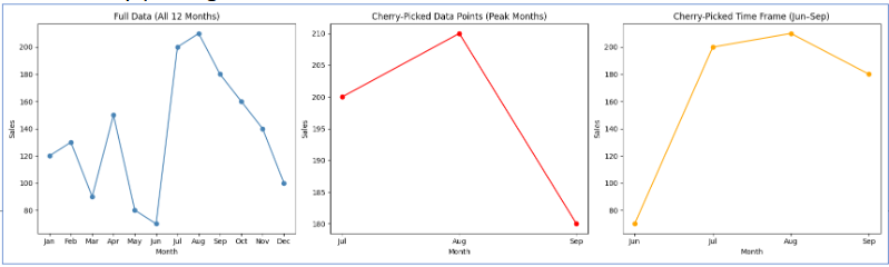
Cherry-Picking
Cherry-picking takes two common forms in business charts:
Cherry-picking data points — citing the one quarter your product outperformed while omitting the six quarters of flat performance.
Cherry-picking time windows — showing stock performance from the trough of a recession to the peak of a recovery to make returns look spectacular, omitting the crash that preceded the trough.
The fix is always the same: show the complete relevant time period and the complete relevant comparison group.
With the common failures catalogued — visual, logical, and causal — we can now turn to what a good chart looks like in practice: purposeful, audience-aware, and built around a single clear finding.
Storytelling with Data
Good visualization is not just technically correct — it is purposeful. The chart answers a specific question for a specific audience.
The Foundation: Who, What, How
Three questions must be answered before opening any charting tool:
- Who is the audience? A data scientist and a board member need different charts of the same data.
- What should they know or do after seeing this? If you cannot state it in one sentence, the chart is not ready.
- How will the data support that message?
Two tools force clarity:
The Big Idea — a single sentence that states the point of view and the stakes. Weak: “Sales are down.” Strong: “Enterprise software sales fell 23% in Q3 because of three lost accounts representing 40% of division revenue — retaining the remaining at-risk accounts requires immediate action on pricing.”
The 3-Minute Story — if you had three minutes with a decision-maker, what are the three things they must leave the room knowing? Everything else is exploratory.
Exploratory vs. Explanatory Analysis
| Exploratory | Explanatory | |
|---|---|---|
| Audience | Yourself | Your audience |
| Purpose | Find patterns and hypotheses | Communicate a specific finding |
| Volume | Many rough charts | One polished chart |
| Annotation | None needed | Essential |
| Mistake | Spending too long here | Presenting these to executives |
The most common mistake: presenting exploratory charts to an explanatory audience. Showing leadership 15 charts to be “thorough” is not transparency — it is transferring your analytical work to the people least equipped to do it. Find the two pearls; do not hand the audience all 200 oysters.
The Six-Step Storytelling Workflow
| Step | What you do |
|---|---|
| 1. Understand the context | Who is the audience? What decision does the chart support? |
| 2. Choose the right visual | Match the chart type to the data and the message |
| 3. Eliminate clutter | Remove gridlines, redundant labels, legend entries that can be replaced by direct labels |
| 4. Focus attention | Highlight the key element with color or annotation; mute everything else |
| 5. Design with purpose | Every choice — color, axis range, aspect ratio — should serve the message |
| 6. Tell a story | Annotate the chart with the finding: “Departures tripled in Q3.” Do not make the viewer figure it out. |
Before applying the storytelling framework in the lab, it is worth pausing on the reasoning error that causes the most damage in business reporting: false causal claims. The full treatment of correlation vs. causation — including the r-value interpretation table, the three conditions for causation, the third variable (confounding) problem, and the directionality problem — is covered in the ANOVA and Correlation lesson. Here is the essential recap for applying these ideas to visualization.
Correlation vs. Causation: Applied to Visualization
The core rule: a chart can show a correlation with perfect technical accuracy and still make a false causal claim — through its title, its annotation, or the language used to present it. “Ice cream sales and drowning rates rise together” is a true correlation; “ice cream causes drowning” is a false causal claim. Both can appear in the same chart depending on how it is labeled.
To establish causation, three conditions must all be met: a statistically significant relationship exists, no confounding variables can account for the association, and the cause precedes the effect in time. Observational data — which is almost everything you will visualize in a business context — rarely meets all three.

Why this matters for AI-generated charts: AI frequently produces titles and interpretation comments that imply causation from correlational data. A chart titled “Marketing Spend Drives Revenue” based on a scatterplot of two correlated variables is making a causal claim the data does not support. When you apply the Trifecta Checkup in the lab activity, checking for false causal language is one of the most reliable ways to find a D failure — the data do not actually support what the visual implies.
Bias
Bias is closely related to false causal claims because it can distort data or its interpretation, making a causal relationship appear stronger, weaker, or entirely different than it really is.
- Selection Bias refers to the systematic exclusion of certain groups from consideration for the sample — the root mechanism underlying several biases below.
- Sample Bias is selection bias applied at the dataset level — certain groups are excluded or overrepresented, so the sample fails to reflect the population of interest. (e.g., Surveying only gym-goers to conclude that exercise increases happiness ignores people who exercise less but are equally happy.)
- Publication Bias is selection bias applied at the literature level — certain studies are excluded from the public record rather than certain people from a sample, producing the same distorting effect one level up. (e.g., Studies showing significant or “interesting” causal effects are more likely to be published, skewing the perceived body of evidence.)
- Measurement Bias is systematic error in how a true value gets recorded — not random noise but a structural problem with the collection instrument itself. Social desirability bias is one specific cause of this, where the respondent rather than the instrument is the source of distortion. (e.g., Using self-reported exercise without verification may overestimate its effect on health outcomes.)
- Confirmation Bias refers to the tendency of researchers or communicators to focus on data that supports a pre-existing causal story while ignoring contradicting evidence. Unlike the biases above, this operates at the interpretation and communication stage rather than at data collection. (e.g., Highlighting only studies where coffee drinkers live longer, while ignoring studies showing no effect or harmful effects.)
Kaiser Fung’s Trifecta Checkup
With visualization principles established and reasoning errors named, we now have the vocabulary to evaluate visualizations systematically. Kaiser Fung’s Trifecta Checkup provides a structured diagnostic that goes beyond visual style to ask whether the chart’s underlying question and data are sound — the two dimensions that AI cannot assess on your behalf.
What Is the Trifecta Checkup?
Kaiser Fung is a statistician, author of Numbers Rule Your World, and creator of the Junk Charts blog. He developed the Trifecta Checkup to address a gap in most visualization criticism: traditional frameworks (following Tufte) focus heavily on visual execution while ignoring whether the chart actually answers a meaningful question with appropriate data.
The framework evaluates every chart on three corners simultaneously:
| Corner | Question | What can go wrong |
|---|---|---|
| Q | What is the question? | Vague, unanswerable, or never stated |
| D | What does the data say? | Wrong metric, missing groups, misleading aggregation, implied causation |
| V | What does the visual say? | Wrong chart type, distorted encoding, missing labels, clutter |
A chart that passes all three corners is excellent. A chart can fail any combination of the three.
The Eight Outcomes
Every visualization falls into one of eight categories based on which corners pass (✓) or fail (✗):
| Label | Q | D | V | What it means |
|---|---|---|---|---|
| ✓ | ✓ | ✓ | ✓ | All three corners pass — an excellent chart |
| q | ✗ | ✓ | ✓ | Good data and visual; question is unclear or unanswerable |
| d | ✓ | ✗ | ✓ | Clear question and good visual; data do not actually answer it |
| v | ✓ | ✓ | ✗ | Clear question and good data; visual execution is poor |
| qd | ✗ | ✗ | ✓ | Good visual; both question and data fail |
| qv | ✗ | ✓ | ✗ | Good data; question and visual both fail |
| dv | ✓ | ✗ | ✗ | Clear question; data and visual both fail |
| qdv | ✗ | ✗ | ✗ | All three corners fail — nothing works |
Why This Framework Matters for AI-Generated Charts
When you use AI to generate a chart, it will almost always produce a visually competent result. AI knows chart types, can label axes, and selects reasonable colors. AI-generated charts tend to pass V by default.
The failures will almost always be in Q and D — and these are the exact failures that require human statistical judgment:
- AI does not know your business question; it infers it from your prompt
- AI will use whatever data you give it without questioning whether it answers the question
- AI may aggregate in convenient ways that are statistically misleading
- AI cannot tell you whether your sample is biased, your time window cherry-picked, or your comparison groups incompatible
This is why the Trifecta is the right framework for AI output evaluation. You are not checking whether AI can make a pretty chart — it can. You are checking whether Q–D–V hold together.
Questions for Rubric To Guide Assessment of Visual
Corner Q — The Question
- Does the chart answer a real, specific question?
- What question does the chart appear to answer to a reader seeing it with no context?
- Is the question specific enough that the chart gives a definitive answer, or must the reader interpret what is being asked?
- Does the chart actually answer that question, or a different one?
Corner D — The Data
- Is the data appropriate and honestly handled?
- Is the variable being plotted the right metric for the question, such as a rate or ratio rather than a raw count?
- Are all relevant groups represented, and would a missing group change the conclusion?
- Is anything aggregated in a way that hides meaningful variation?
- Does the title or annotation imply a causal claim the data does not support?
Corner V — The Visual
- Does the visual encode the data well?
- Is this the right chart type for the question and data? What might be a better alternative?
- Do the visual elements accurately encode the values, including axis origins, bar heights, area, or color scale?
- Does the eye go first to the most important finding?
- What is missing, such as units, sample size, missing-data notes, or a source line?
Combining Trifecta and Schmidt et al. (2023)
This table shows the most natural fit, but a reasoning error can appear in more than one corner depending on how a guided rubric is structured.
| Reasoning Error | Natural Trifecta Corner(s) |
|---|---|
| Misreading Charts — incorrect conclusions from visual distortions or misread elements | V (Visual) |
| Cherry-Picking — selecting only data points or time frames that support a predetermined conclusion | D (Data) |
| Arbitrary Thresholds — judging against a cutoff with no clear justification | D (Data) or Q (Question) |
| Data Quality Issues — using incomplete, inconsistent, or uncertain data without disclosing limitations | D (Data) |
| Ignoring Statistical Nuance — overlooking subgroup differences, confounding, or correlation vs. causation | D (Data) or Q (Question) |
| Misrepresenting Scientific Research — oversimplifying or cherry-picking findings from studies | Q (Question) or D (Data) |
| False Causal Claims — inferring cause-and-effect from visual patterns without adequate evidence | Q (Question) |
Summary and Review
Using AI
Use the following prompts with our chatbot (bottom right of this page) to explore these concepts further.
- What is the difference between generative and predictive AI? At what point in a business analytics workflow would you use each?
- Why do LLMs hallucinate, and why is this a structural property rather than a fixable bug? What does it tell you about the relationship between language prediction and factual accuracy?
- Compare zero-shot, few-shot, and chain-of-thought prompting. When would you choose each for a data analysis task?
- What are the six aesthetics in data visualization, and which is the most perceptually precise? How do you decide which aesthetic to use for which type of data?
- What is the difference between a chart that is Bad vs. Wrong vs. Ugly in Wilke’s taxonomy? Give a business example of each.
- What are the three conditions required to establish causation? Why is a strong correlation insufficient on its own?
- A chart passes V but fails D in Kaiser Fung’s framework. Describe what this looks like in practice — what kind of chart would be visually polished but analytically misleading?
- What specific types of failures should you expect when AI generates a data visualization? Which corners of the Trifecta are AI’s weak points and why?
Generative AI Lab
1. You ask an AI tool to “make a chart of home values by season” and it returns a bar chart with a y-axis starting at $280,000. The chart’s title reads: “Seasonal variation in home values is dramatic.” Identify every hallucination warning sign and visualization failure present, and explain what a corrected version would look like.
Two problems are present. Hallucination — overconfident language: the word “dramatic” makes a causal or magnitude claim the data may not support; the actual range might be a few percent. Visualization failure — truncated y-axis (Bad): starting the bar chart at $280,000 instead of $0 visually exaggerates differences that may be small in absolute terms. A corrected version would: (1) reset the y-axis to 0; (2) replace the title with a neutral, accurate description such as “Mean home value by season, 2016–2023”; and (3) add a data label showing the actual mean for each bar so the viewer can assess the magnitude directly, rather than inferring it from bar height alone.
2. An AI generates a visualization with the title “Marketing Spend Drives Revenue” based on a scatterplot showing a positive correlation between the two variables. Apply the Trifecta Checkup: which corners pass, which fail, and why?
- Q (question): Passes on the surface — the question is clear. But the question as implied by the title (“does marketing spend drive revenue?”) is a causal question that a scatterplot cannot answer. If the intended question is actually “are these two variables correlated?”, the question corner passes; if it is causal, it fails.
- D (data): Fails. Correlation data does not answer a causal question. The AI has used observational data to imply an experimental result. This is a D failure — the data do not support what the title claims.
- V (visual): Passes. A scatterplot is the correct chart type for displaying the relationship between two continuous variables.
Trifecta label: d (or qd if the question is evaluated as causal) — clear visual, but the data corner fails because the implied claim is not supported. Fix: retitle the chart “Correlation between marketing spend and revenue (r = ___)“, which accurately describes what the data show.
3. Rewrite the following weak visualization prompt so that it would produce a chart you could submit without editing: “Make a chart of the zillow data.”
A strong rewrite:
“Using ggplot2 and the zillow.csv dataset, create a bar chart showing mean
home_value(y-axis, labeled in dollars, starting at 0) for each level ofseason(x-axis). Sort bars from highest to lowest mean. Add a title that describes what the chart shows without implying causation. Use a minimal theme with no gridlines on the x-axis. Do not truncate the y-axis.”
This is stronger because it: names the dataset and variables; specifies the chart type and axis requirements; requires a zero-based y-axis explicitly; asks for a neutral, non-causal title; and defines visual style. The original prompt leaves every consequential decision to the AI — and AI will make at least one of them wrong.
Visualization Principles Lab
1. A bar chart shows website traffic across five marketing channels. The y-axis runs from 280,000 to 310,000 visits, making the lowest channel appear to have nearly zero traffic compared to the highest. Classify this chart using Wilke’s taxonomy (Good, Ugly, Bad, Wrong) and explain the correct fix.
This is Bad — not Wrong. The numbers are accurate, but the visual is perceptually misleading. A truncated y-axis on a bar chart distorts the encoding: bar height represents magnitude relative to zero, and starting the y-axis at 280,000 makes the smallest channel look negligible when the actual difference is less than 10%. Most viewers read the visual pattern before the axis — which is exactly what the truncation exploits. Fix: set the y-axis to start at 0 for any bar chart. If the actual range (280K–310K) is the relevant information, switch to a line chart or dot plot where a non-zero baseline is acceptable, and annotate the axis break visually.
2. A health journalist reports: “Cities with more fast food restaurants per capita have higher obesity rates — our data from 200 cities confirms that fast food causes obesity.” Identify which reasoning error(s) from Schmidt et al.’s list are present and explain the correct interpretation.
Two errors are present. False causal claims — the journalist infers causation from an observational correlation. No experimental design is described, and no confounds are ruled out. Ignoring statistical nuance — the correlation across 200 cities does not establish that fast food causes obesity at the individual level; there are obvious confounds (income, urban density, food access, physical activity infrastructure) that are correlated with both fast food availability and obesity rates.
The correct interpretation: cities with more fast food restaurants also tend to have higher obesity rates. This association is worth investigating but is consistent with multiple explanations — fast food availability, socioeconomic factors, or a third variable like urban food deserts that predicts both simultaneously. Causation would require ruling out these confounds through experimental design or rigorous natural experiment methods.
3. Write a strong Big Idea sentence for the following scenario, then identify which of the six workflow steps the analyst most likely skipped: A data team presents a chart titled “Customer Satisfaction Survey Results Q3” showing 12 metrics in a radar chart with no annotations, and the only takeaway the leadership team reaches is “some scores went up and some went down.”
Strong Big Idea: “Net Promoter Score dropped 18 points in Q3 — the sharpest single-quarter decline in two years — driven entirely by customers who contacted support more than twice, indicating that repeat service contacts are the primary driver of dissatisfaction.”
Steps most likely skipped: Step 1 (Understand the context) — the analyst did not define what decision the chart was meant to support, so no finding was prioritized. Step 4 (Focus attention) — with 12 metrics on a radar chart and no highlighting, the viewer’s eye has no guide. Step 6 (Tell a story) — no annotation communicates the key takeaway, forcing the leadership team to draw their own (weak) conclusions. A radar chart with 12 metrics is also a poor choice for Step 2 (Choose the right visual) — radar charts make comparison across categories difficult and are generally not recommended for more than 5–6 metrics.
Summary
This lesson covered the responsible use of generative AI and the principles of honest, effective data visualization.
| Topic | Key concepts |
|---|---|
| AI applied to visualization | Hallucinations, prompt strategies, and the handles/requires-judgment division — introduced in the first lesson — applied specifically to chart output |
| AI strengths and limits | Reliable on V (visual execution, code syntax); unreliable on Q (question framing) and D (data quality) |
| Hallucinations in charts | Unverified labels, invented sources, contradictory titles, causal language, implausible values |
| Four visualization purposes | Describe, predict, explain, understand — each demands different design choices |
| Six aesthetics | Position (most precise), color (hue/value), size, shape, line width, line type |
| Three color purposes | Distinguish categories, represent values, highlight — use the wrong one and the chart misleads |
| Color pitfalls | Too many categories, decorative color, nonmonotonic scales, color-vision deficiency |
| Good/Ugly/Bad/Wrong | Good: accurate + clear; Ugly: aesthetic flaws only; Bad: perceptually misleading; Wrong: mathematically incorrect |
| Seven reasoning errors | Misreading, cherry-picking, arbitrary thresholds, data quality, ignoring nuance, misrepresenting research, false causal claims |
| Aspect ratio and truncation | Same data reads differently at different ratios; bar chart y-axis must start at 0 |
| Correlation coefficient | r between −1 and +1; sensitive to outliers; does not imply causation |
| Three conditions for causation | Significant relationship, no confounds, correct temporal ordering |
| Third variable problem | Confounders create spurious correlations; common in business observational data |
| Who/What/How | Three questions before any chart; if you cannot state the “what” in one sentence, stop |
| Big Idea | Point of view + stakes in one sentence; specific enough to guide every design decision |
| Exploratory vs. explanatory | Exploratory for yourself; explanatory for your audience; never present exploratory charts to decision-makers |
| Six-step workflow | Context → Visual → Eliminate clutter → Focus attention → Design with purpose → Tell a story |
| Trifecta Checkup | Q (question), D (data), V (visual); eight outcome labels; AI passes V by default; Q and D require you |
What comes next: This is the final lesson of the course. The tools introduced here — the Trifecta Checkup, the storytelling workflow, and the reasoning-error framework — do not replace the statistical methods you learned in earlier modules. They are how you communicate and evaluate those methods honestly. A t-test result, an ANOVA table, or a regression coefficient is only meaningful if the question was well-posed, the data are appropriate, and the output is presented without distortion. Every concept in this lesson is a lens you can apply to any analysis you produce or consume going forward — in a business meeting, in a published report, or in an AI-generated output you did not write yourself.