This site uses analytics to measure page views and engagement.
R∑
Course Assistant
R & Statistics
Ask me anything about R, statistics concepts, or your code. Please note that AI tools can make mistakes, so always double-check responses against the course materials and your own work.
mean vs median?
What is skewness?
How do I use filter()?
Explain na.rm=TRUE
How to read a CSV?
What is kurtosis?
Data Preparation
This lesson covers data preparation in R — the full workflow for inspecting, cleaning, and reshaping a dataset so it is ready for analysis. Data types, coercion, and missing data handling move here from the Intro lesson, where they belong: taught in the context of real cleaning problems rather than as isolated concepts.
We begin with data types and coercion: R assigns a type to every variable when a dataset is loaded, and the wrong type causes silent errors that look fine but produce wrong results. A number stored as a character will break a mean calculation without warning. A category stored as numeric will produce a meaningless average. Checking and correcting types — including dates with lubridate — before doing anything else is the first habit of a careful analyst.
We then move to missing data: identifying where values are absent, understanding whether they are missing at random or systematically, and deciding whether to omit, impute, or work around them. This is where most analytical errors enter a dataset — AI will execute whatever you ask without flagging structural bias introduced by removing the wrong rows.
The lesson continues with the dplyr toolkit: filter(), select(), arrange(), mutate(), group_by(), and summarize() — chained with %>%. These are the functions you will use in every subsequent lesson to prepare data before modeling or visualization.
We close with advanced visualization: single-variable bar charts that require cleaning first (recoding, dropping NAs), multi-variable grouped and stacked charts, boxplots by group, and scatterplots with trend lines — all using cleaned data.
By the end of this lesson, you should be able to load a messy dataset, diagnose its problems, apply a dplyr cleaning workflow, and produce a visualization that reflects the prepared data. Work through every code example in your own .R script file alongside the reading.
AI and Data Preparation: Where the Stakes Are Highest
Data preparation is the phase of analysis where AI errors are most consequential — and most invisible. AI can write dplyr pipelines, suggest coercion functions, and generate filter conditions quickly and correctly. But the decisions that matter most in this phase are not about syntax:
AI handles well
Requires your judgment
Writing filter(), mutate(), select() pipelines
Deciding which observations to filter out — and whether that introduces bias
Suggesting as.factor() or as.numeric() coercions
Recognizing when a variable is miscoded in a way that silently corrupts analysis
Generating group_by() + summarize() code
Deciding which groups make sense to compare for your business question
Proposing na.omit() or drop_na() for missing data
Deciding whether removing missing values on a key demographic introduces selection bias
Producing clean, readable code
Noticing when the cleaning logic is technically valid but analytically wrong
The critical insight: removing missing data is not automatically “cleaning.” If missing values are concentrated in a particular region, income bracket, or customer segment, removing them can systematically distort every analysis that follows. AI will execute whatever you ask it without flagging that issue — because it is a statistical judgment, not a code error. This is why understanding the why behind each data preparation step matters as much as learning the functions.
At a Glance
This lesson is about developing the habits of a careful analyst before any modeling begins. R will not warn you when a number is stored as text or a category is coded as a number — it will simply produce wrong results. The skills here — checking types, correcting them, filtering and reshaping with dplyr, handling missing values, and verifying your work with a visualization — are not preliminary steps you do once and move on from. They are the foundation of every analysis you will run in the MSBA program. The goal is not just to learn the functions, but to internalize a workflow: inspect first, clean deliberately, verify visually.
Lesson Objectives
Load a dataset, evaluate variable types using class() and str(), and apply coercion functions (as.factor(), as.numeric(), as.character(), as.Date(), and lubridate helpers) to correct type mismatches before analysis begins.
Identify and handle missing values using is.na(), sum(is.na()), na_if(), na.omit(), and drop_na(), and explain the analytical implications of each strategy — including when removing rows introduces selection bias.
Use the core dplyr verbs — filter(), select(), arrange(), mutate(), case_when(), and group_by() with summarize() — to clean, reshape, and aggregate a data frame, chaining steps together with the pipe operator (%>%).
Apply recode() for direct value replacement and case_when() for conditional logic; use droplevels() after na_if() to remove empty factor levels.
Produce a scatterplot, grouped bar chart, and boxplot from a prepared dataset and interpret the visual output as a quality check on the cleaning workflow.
Consider While Reading
Data types and missing data come first in this lesson for a reason: every dplyr operation you run afterward depends on the data being correct. A wrong type or an unhandled NA will silently corrupt grouped summaries, recoding logic, and visualizations without any error message. Get in the habit of running str() and summary() before touching anything else.
Every dplyr function does one thing cleanly — the power comes from chaining them. As you work through each function, keep asking: how would I combine this with the previous step using %>%? The pipe is not just a convenience; it is the habit that makes your code readable and your workflow reproducible.
When you use group_by() with summarize(), you are shifting from thinking about individual rows to thinking about groups. Notice how the same variable — say, AnnualSpend — means something different when you look at its overall mean versus its mean broken out by Region or Churned. The grouped summary is where business questions actually get answered.
The choice of how to handle missing data is an analytical decision, not a technical one. AI will execute na.omit() or drop_na() instantly and without warning — but only you can judge whether the rows being removed are a random handful or an entire demographic group. Make that judgment explicitly before running any removal code.
Data Types and Coercion
Before cleaning or transforming a dataset, you need to confirm that R is treating each variable as the correct type. A variable stored as text when it should be numeric will silently break calculations; a number stored as a factor will produce the wrong chart. This section covers how to identify data types and how to convert between them — skills you will use immediately in the dplyr examples that follow.
R is dynamically typed — every variable receives a type based on what you assign to it. Wrong types cause silent errors: a number stored as text will not calculate.
The five types you will use most often:
Type
What it stores
Example
factor
Categories (nominal or ordinal)
Industry, Grade
numeric
Real numbers or integers
Wage, GPA
character
Text strings
Name, ZIP code
logical
TRUE or FALSE
Is loyal? Did churn?
Date
Calendar dates
Hire date
# Read in gig dataset — required for examples in the data types sectiongig <-read.csv("data/gig.csv",stringsAsFactors =FALSE,na.strings ="")dim(gig)
[1] 604 4
head(gig)
  EmployeeID  Wage     Industry        Job
1          1 32.81 Construction    Analyst
2          2 46.00   Automotive   Engineer
3          3 43.13 Construction  Sales Rep
4          4 48.09   Automotive      Other
5          5 43.62   Automotive Accountant
6          6 46.98 Construction   Engineer
# Check types from the gig datasetclass(gig$Industry) ## "character"
[1] "character"
class(gig$Wage) ## "numeric"
[1] "numeric"
class(gig$EmployeeID) ## "integer"
[1] "integer"
Factor: Nominal Variable
A nominal variable has categories with no meaningful order.
Examples: Industry, Job title, Gender, State
# Small example firstindustry <-c("Automotive", "Tech", "Construction", "Automotive")class(industry) ## "character"
[1] "character"
# Coerce to factorindustry <-as.factor(industry)class(industry) ## "factor"
# Apply the same fix to the gig datasetgig$Industry <-as.factor(gig$Industry)gig$Job <-as.factor(gig$Job)class(gig$Industry) ## confirm: "factor"
[1] "factor"
levels(gig$Industry) ## see all categories
[1] "Automotive" "Construction" "Tech"
R will treat each unique value as a level. Use as.factor() whenever you load categorical data.
Factor: Ordinal Variable
An ordinal variable has categories with a meaningful order.
Examples: course grade (A > B > C), satisfaction (High > Medium > Low)
library(tidyverse)# Small examplesatisfaction <-c("High", "Low", "Medium", "High", "Low")data <-data.frame(satisfaction)data <- data %>%mutate(satisfaction =recode(satisfaction,"High"=3,"Medium"=2,"Low"=1))data$satisfaction ## [1] 3 1 2 3 1
[1] 3 1 2 3 1
Ordinal data can be stored two different ways in R, and the choice has real analytical consequences. The first is to recode the categories to numbers — Low → 1, Medium → 2, High → 3, as in the example above. This makes arithmetic possible: you can take a mean, compute a correlation, or feed the variable into a model. But it asserts something the data may not support — that the distance from Low to Medium is exactly the same as from Medium to High. For subjective scales (satisfaction, agreement, Likert ratings) that equal-spacing assumption is a judgment call, not a fact, and numeric coding also throws away the readable labels.
The second is to store the variable as an ordered factor, which keeps the labels and records their rank order without claiming the gaps are equal:
satisfaction <-c("High", "Low", "Medium", "High", "Low")satisfaction <-factor(satisfaction,levels =c("Low", "Medium", "High"),ordered =TRUE)satisfaction ## Levels: Low < Medium < High
[1] High   Low    Medium High   Low
Levels: Low < Medium < High
With an ordered factor, R knows Low < Medium < High, so frequency tables and bar charts come out in the correct order automatically and comparison operators work. Asking it for mean() returns NA with a warning rather than a number — which is the point, since the mean of an ordinal variable depends on the equal-spacing assumption you may not want to make.
Which should you use? Default to an ordered factor when your goal is to describe an ordinal variable — counts, proportions, the median, and distribution bar charts — because it respects the measurement and keeps your charts honest. Reach for numeric coding only when you have a deliberate reason to treat the scale as interval: a mean you are prepared to defend, a correlation, or a model input — and state that assumption when you do. AI will generate either version on request; judging which fits your variable and your question is the analytical decision this lesson is about.
Numeric: Real (Continuous) Variable
A continuous numeric variable can take any value along a range.
Examples: Wage, GPA, Temperature, Sales revenue
# Wage is already numeric in gigclass(gig$Wage) ## "numeric"
[1] "numeric"
# What if a number comes in as text?wage_text <-"42.75"class(wage_text) ## "character"
# IMPORTANT: as.numeric() returns NA if text cannot be converted# Always check for NAs after coercionsum(is.na(as.numeric(gig$Wage)))
[1] 0
Note:as.numeric() returns NA if the text cannot be converted — always check for NAs after coercion.
Numeric: Integer (Discrete) Variable
An integer variable holds whole numbers only — counts, rankings, IDs.
Examples: Number of children, Points scored, Employee ID
# Create an integer directlychildren <-as.integer(3)class(children) ## "integer"
[1] "integer"
# The L suffix also creates an integerchildren <-3Lclass(children) ## "integer"
[1] "integer"
# IMPORTANT: as.integer() truncates — it does NOT roundas.integer(4.9) ## [1] 4 (not 5)
[1] 4
as.integer(4.1) ## [1] 4
[1] 4
# EmployeeID in gig is integer — makes sense, no decimals neededclass(gig$EmployeeID)
[1] "integer"
Use integer when the variable can only take whole number values.
Character: Text Variable
A character variable stores text — names, labels, codes, descriptions.
Examples: Employee name, ZIP code, Email address
name <-"Alice Johnson"zip <-"23185"class(name) ## "character"
[1] "character"
class(zip) ## "character"
[1] "character"
# Convert a number to character when neededid_num <-1042id_char <-as.character(id_num)class(id_char) ## "character"
[1] "character"
id_char ## [1] "1042"
[1] "1042"
Important: ZIP codes look like numbers but must stay as character. If you convert "02134" to numeric it becomes 2134 — the leading zero is permanently lost.
Logical: TRUE / FALSE Variable
A logical variable stores TRUE or FALSE — the result of any comparison.
Examples: Is the customer loyal? Did the employee churn? Is the order complete?
# Comparisons produce logical valueswage <-45.00wage >40## [1] TRUE
[1] TRUE
wage ==50## [1] FALSE
[1] FALSE
# Combine conditions with logical operatorswage >30& loyal ## TRUE AND TRUE = TRUE
[1] TRUE
wage >60| loyal ## FALSE OR TRUE = TRUE
[1] TRUE
!loyal ## NOT TRUE = FALSE
[1] FALSE
# Practical use on gig datasetsum(gig$Wage >40) ## how many employees earn over $40/hr?
[1] 373
Date Variable
A Date variable stores calendar dates so R can sort, filter, and calculate time differences. Without coercion, dates load as character and cannot be used for date math.
# Without coercion, a date is just texthired <-"2021-06-15"class(hired) ## "character"
[1] "character"
# Coerce to Date with as.Date()hired <-as.Date("2021-06-15")class(hired) ## "Date"
[1] "Date"
# Now you can do date arithmetictoday <-Sys.Date()days_employed <- today - hireddays_employed ## Time difference in days
Time difference of 1822 days
The lubridate package makes date parsing much easier, especially for non-standard formats. Use mdy() for month/day/year strings, ym() for year-month strings (it adds a placeholder day), and ymd() for ISO format. Once parsed, month() and year() extract components for grouping or filtering.
# Parse year-month strings (e.g. from the Lubridate.csv dataset)UseDates <-read.csv("data/Lubridate.csv")UseDates$Date <-ym(UseDates$Date)# Extract month and year as numbers for groupingUseDates$month <-month(UseDates$Date)UseDates$year <-year(UseDates$Date)# Create a season variable using case_whenUseDates <- UseDates %>%mutate(season =as.factor(case_when( month %in%3:5~"Spring", month %in%6:8~"Summer", month %in%9:11~"Fall",TRUE~"Winter" )))summary(UseDates$season)
  Fall Spring Summer Winter
     9      9     12      9
# Filter to a single yearUseDate2022 <-filter(UseDates, year ==2022)
Checking Types: The Full Workflow
Always run these three steps on any new dataset before analysis.
gig <-read.csv("data/gig.csv")# Step 1 — See all types at oncestr(gig)
# Problem 2: age contains "89 OR OLDER" — recode first, then coercegss.2016$age <-recode(gss.2016$age, "89 OR OLDER"="89")gss.2016$age <-as.numeric(gss.2016$age)class(gss.2016$age) ## "numeric"
[1] "numeric"
# Final check — confirm all types are correctsummary(gss.2016)
       grass           age
 DK       : 110   Min.   :18.00
 IAP      : 911   1st Qu.:34.00
 LEGAL    :1126   Median :49.00
 NOT LEGAL: 717   Mean   :49.16
 NA's     :   3   3rd Qu.:62.00
                  Max.   :89.00
                  NA's   :10
Common dplyr Functions
Arrange
Sorting or arranging the dataset allows you to specify an order based on variable values.
Sorting allows us to review the range of values for each variable, and we can sort based on a single or multiple variables.
Notice the difference between sort() and arrange() functions below.
The sort() function sorts a vector.
The arrange() function sorts a dataset based on a variable.
To conduct an example, read in the data set called gig.csv from your working directory.
  EmployeeID  Wage     Industry        Job
1        110 51.00 Construction      Other
2         79 50.00   Automotive   Engineer
3        348 49.91 Construction Accountant
4        373 49.91 Construction Accountant
5        599 49.84   Automotive   Engineer
6         70 49.77 Construction Accountant
Subsetting and Filtering
Subsetting or filtering a data frame is the process of indexing, or extracting a portion of the data set that is relevant for subsequent statistical analysis. Subsetting allows you to work with a subset of your data, which is essential for data analysis and manipulation. One of the most common ways to subset in R is by using square brackets []. We can also use the filter() function from tidyverse.
We use subsets to do the following:
View data based on specific data values or ranges.
Compare two or more subsets of the data.
Eliminate observations that contain missing values, low-quality data, or outliers.
Exclude variables that contain redundant information, or variables with excessive amounts of missing values.
When working with data frames, you can subset by rows and columns using two indices inside the square brackets: data[row, column]. For example, if you have df <- data.frame(a = 1:3, b = c(“X”, “Y”, “Z”)), df[1, 2] would return the value “X”, which is the first row and second column. If you want the entire first row, you would use df[1, ], and to get the second column, you’d use df[, 2].
You can also use logical conditions to subset. For instance, x[x > 20] would return all values in x greater than 20, and in a data frame, you could filter rows where a certain condition holds, such as df[df$a > 1, ], which returns rows where column a has values greater than 1.
Let’s do an example using the customers.csv file we read in earlier as customers in the last lesson. Base R provides several methods for subsetting data structures. Below uses base R by using the square brackets dataset[row, column] format.
customers <-read.csv("data/customers.csv", stringsAsFactors =TRUE)#To subset, note the dataset[row,column] format#Results hidden to save space, but be sure to try this code in your .R file. #Data in 1st rowcustomers[1,] #Data in 2nd columncustomers[,2] #Data for 2nd column/1st observation (row)customers[1,2] #First 3 columns of datacustomers[,1:3]
One of the most powerful and intuitive ways to subset data frames in R is by using the filter() function from the dplyr package, which is part of the tidyverse. Tidyverse is extremely popular when filtering data.
The filter function is used to subset rows of a data frame based on certain conditions.
The below example filters data by the College variable when category values are “Yes” and saves the filtered dataset into an object called college.
#Filtering by whether the customer has a "Yes" for college. #Saving this filter into a new object college which you should see in your global environment. college <-filter(customers, College =="Yes")#Showing first 6 records of college - note the College variable is all Yes's. head(college)
   CustID    Sex     Race  BirthDate College HHSize Income Spending Orders
1 1530016 Female    Black 12/16/1986     Yes      5  53000      241      3
2 1531136   Male    White   5/9/1993     Yes      5  94000      843     12
3 1532160   Male    Black  5/22/1966     Yes      2  64000      719      9
4 1532307   Male    White  9/16/1964     Yes      4  60000      582     13
5 1532387   Male    White  8/27/1957     Yes      2  67000      452      9
6 1533017 Female Hispanic  5/14/1985     Yes      3  84000      153      2
  Channel
1      SM
2      TV
3      TV
4      SM
5      SM
6     Web
Using the filter command, we can add filters pretty easily by using an & for and, or an | for or. The statement below filters by College and Income and save the new dataset in an object called twoFilters.
twoFilters <-filter(customers, College =="Yes"& Income <50000)head(twoFilters)
   CustID    Sex     Race  BirthDate College HHSize Income Spending Orders
1 1533697 Female    Asian  10/8/1974     Yes      3  42000      247      3
2 1535063 Female    White 12/17/1982     Yes      3  42000      313      4
3 1544417   Male Hispanic  3/14/1980     Yes      4  46000      369      3
4 1547864 Female Hispanic  6/15/1987     Yes      2  44000      500      5
5 1550969 Female    White   4/8/1978     Yes      4  47000      774     16
6 1553660 Female    White   8/2/1988     Yes      2  47000      745      5
  Channel
1     Web
2      TV
3      TV
4      TV
5      TV
6      SM
Next, we can do an or statement. The example below uses the filter command to filter by more than one category in the same field using the | in between the categories.
   CustID    Sex  Race  BirthDate College HHSize Income Spending Orders Channel
1 1530016 Female Black 12/16/1986     Yes      5  53000      241      3      SM
2 1531136   Male White   5/9/1993     Yes      5  94000      843     12      TV
3 1532160   Male Black  5/22/1966     Yes      2  64000      719      9      TV
4 1532307   Male White  9/16/1964     Yes      4  60000      582     13      SM
5 1532387   Male White  8/27/1957     Yes      2  67000      452      9      SM
6 1533791   Male White 10/27/1999     Yes      1  97000     1028     17     Web
The str_detect() function is used to detect the presence or absence of a pattern (regular expression) in a string or vector of strings. It returns a logical vector indicating whether the pattern was found in each element of the input vector.
Using str_detect it with a filter function allows you to pull observations based on the inclusion of a string pattern.
In R, the select() function is part of the dplyr package, which is used for data manipulation. The select() function is specifically designed to subset or choose specific columns from a data frame. It allows you to select variables (columns) by their names or indices.
Both statements below select Income, Spending, and Orders variables from the customers dataset and form them into a new dataset called smallData.
The pipe operator takes the output of the expression on its left-hand side and passes it as the first argument to the function on its right-hand side. This enables you to chain multiple functions together, making the code easier to understand and debug.
If we want to keep our code tidy, we can add the piping operator (%>%) to help combine our lines of code into a new object or overwriting the same object.
This operator allows us to pass the result of one function/argument to the other one in sequence.
The below example uses a select() function to pull Income, Spending, and Orders variables from the customers dataset and save it as a new object called smallData. It is an identical request to the one directly above, but written with the piping operator.
Counting allows us to gain a better understanding and insights into the data.
This helps to verify that the data set is complete or determine if there are missing values.
In R, the length() function returns the number of elements in a vector, list, or any other object with a length attribute. It essentially counts the number of elements in the specified object.
#Gives the length of Industrylength(gig$Industry)
[1] 604
For counting using tidyverse, we typically use the filter and count function together to filter by a value or state and then count the filtered data.
In the function below, I use the piping operator to link together the filter and count functions into one command.
Note that we need a piping operator (%>%) before each new function that is part of the chunk.
# Counting with a Categorical Variable# Here we are filtering by Automotive Industry and then counting the number and saving it in a new object called countAutocountAuto <- gig %>%filter(Industry=="Automotive") %>%count()countAuto #190
    n
1 190
Below, we are filtering by Wage and the counting.
# Counting with a Numerical Variable# We could also save this in an object. gig %>%filter(Wage >30) %>%count() ##536
    n
1 536
We learned that there are 190 employees in the automotive industry and there are 536 employees who earn more than $30 per hour.
We could also calculate the number of people with wages under or equal to 30.
#We find 68 Wages under or equal to 30WageLess30 <- gig %>%filter(Wage <=30) %>%count() #WageLess30
   n
1 68
How many Accountants are there in the Job Category of the gig data set. The answer is shown below. Use filter and count to calculate this answer.
   n
1 83
Handling Missing Data
Missing data is a common issue in data analysis and can arise for various reasons, such as data collection errors, non-responses in surveys, or data corruption. In R, handling missing data is crucial to ensure accurate and reliable analysis. Missing values are typically represented by NA (Not Available) in R.
Missing data needs to be closely evaluated and verified within each variable whether the data is truly blank, has no answer, or is marked with a character value such as the text N/A.
Missing data needs to be closely evaluated to see if the missing value is meaningful or not. If the variable that has many missing values is deemed unimportant or can be represented using a proxy variable that does not have missing values, the variable may be excluded from the analysis.
After a data set is loaded, there are three common strategies for dealing with missing values.
The omission strategy recommends that observations with missing values be excluded from subsequent analysis.
The imputation strategy recommends that the missing values be replaced with some reasonable imputed values. For example, imputing missing values using techniques like mean/median substitution or regression models can be considered.
Numeric variables: replace with the average.
Categorical variables: replace with the predominant category.
Ignore your missing data if the function works without it.
When you ignore missing data because your function works without it, the missing values are typically excluded from the calculations by default. In R, many functions, such as mean(), sum(), or lm(), have arguments like na.rm = TRUE to explicitly remove missing values during computation. Ignoring missing data can simplify the analysis, but it comes with potential consequences.
The choice of approach depends on the nature of the missingness, which can be categorized as Missing Completely at Random, Missing at Random, or Missing Not at Random. Addressing missing data appropriately is essential to maintain the validity of statistical analyses and avoid biases.
Limitations of Using a Missing Data Technique
Recommended Closer Evaluation of Missing Data
There are limitations of the techniques listed above (omission, imputation, and ignore).
Reduction in Sample Size: Ignoring missing data leads to a smaller effective sample size, which may reduce the power of your analysis and the reliability of the results.
Bias: If the missing data are not Missing Completely at Random, ignoring them may introduce bias. For example, if specific groups or patterns are overrepresented in the remaining data, the results may not generalize to the full dataset.
Distorted Metrics: Calculations that ignore missing values (e.g., averages, sums) might not reflect the true population parameters, especially if the missing data are systematically different from the observed data. In addition, if a large number of values are missing, mean imputation will likely distort the relationships among variables, leading to biased results.
Incorrect Inferences: Ignoring missing data without considering its nature could lead to incorrect conclusions, as the analysis only reflects the subset of available data.
Consider a dataset used to predict factors that lead to intubation due to COVID-19. Suppose one variable, “Number of pregnancies,” contains missing data (NAs) for all men, as the question is not applicable to them. If we were to compare this variable with another, “Intubated due to COVID-19: Yes/No,” simply omitting the rows with blanks (NAs) could lead to the exclusion of an entire gender, distorting the analysis. In this case, a different approach to handling missing data would be more appropriate to ensure the dataset remains representative. Additionally, if a value is not blank but is considered missing for analysis purposes, the data should be consistently processed (e.g., mutated or recoded) to align with the chosen technique for handling true missing values.
na.rm
The na.rm parameter in R is a convenient way to handle missing values (NA) within functions that perform calculations on datasets. The parameter stands for “NA remove” and, when set to TRUE, instructs the function to exclude missing values from the computation.
y <-c(1, 2, NA, 3, 4, NA)# These lines runs, but do not give you anything useful.sum(y)
[1] NA
mean(y)
[1] NA
Many functions in R include parameters that will ignore NAs for you.
sum() and mean() are examples of this, and most summary statistics like median() and var() and max() also use the na.rm parameter to ignore the NAs. Always check the help to determine if na.rm is a parameter.
sum(y, na.rm=TRUE)
[1] 10
mean(y, na.rm=TRUE)
[1] 2.5
# na.omit removes the NAs from the vector of dataset. Here, it works for removing NAs from the vector. y <-na.omit(y)
na.rm with a Dataset
Using a dataset, we need the _data\(variable_ format, like mean(data\)column, na.rm = TRUE) calculates the mean of the non-missing values in the specified column or variable. This approach is straightforward and useful when the presence of missing values would otherwise cause an error or return an NA result.
summary(gig)
   EmployeeID         Wage               Industry           Job
 Min.   :  1.0   Min.   :24.28   Automotive  :190   Engineer  :191
 1st Qu.:151.8   1st Qu.:34.19   Construction:366   Other     : 88
 Median :302.5   Median :41.88   Tech        : 38   Accountant: 83
 Mean   :302.5   Mean   :40.08   NA's        : 10   Programmer: 80
 3rd Qu.:453.2   3rd Qu.:45.87                      Sales Rep : 77
 Max.   :604.0   Max.   :51.00                      (Other)   : 69
                                                    NA's      : 16
mean(gig$Wage, na.rm=TRUE)
[1] 40.0828
is.na()
In R, the is.na() function is used to check for missing (NA) values in objects like vectors, data frames, or arrays. It returns a logical vector of the same length as the input object, where TRUE indicates a missing value and FALSE indicates a non-missing value.
#Counts the number of all NA values in the entire datasetCountAllBlanks <-sum(is.na(gig)); CountAllBlanks
[1] 26
#Gives the observation number of the observations that include NA valueswhich(is.na(gig$Industry))
[1] 24 139 361 378 441 446 479 500 531 565
#Produces a dataset with observations that have NA values in the Industry field. ShowBlankObservations <- gig %>%filter(is.na(Industry))ShowBlankObservations
#Counts the number of observations that have NA values in the Industry field. Industry is categorical, so we can count values based on it. CountBlanks <-sum(is.na(gig$Industry)); CountBlanks
[1] 10
#Counts the number of observations that have NA values in the Wage field. CountBlanks <-sum(is.na(gig$Wage)); CountBlanks
[1] 0
Sentinel Values
A sentinel value is a real, non-blank value that has been entered to stand in for “missing.” Instead of leaving a cell empty (which R reads as NA), whoever built the dataset typed a placeholder code — a number such as -1, -2, -99, 0, or 999, or text such as "N/A", "Unknown", or "Missing". This is the situation described earlier: data that “is not truly blank” but should be treated as missing for analysis.
The danger is that R has no way to know these codes are not genuine data. A Wage of -99 entered to mean “not reported” is still a valid number, so mean(gig$Wage) will average it in and silently pull the result down. is.na() returns FALSE for it, na.rm = TRUE will not touch it, and na.omit() will keep the row. The missing value hides in plain sight and corrupts every calculation without producing a single warning.
Negative numbers like -1 and -2 are common sentinels precisely because many business variables — wage, age, count, spend — can never legitimately be negative. A human reading the data understands that -1 means “not applicable” and -2 means “declined to answer,” but R still treats both as ordinary numbers. The convention is unambiguous to a person and invisible to the software.
The defense is to inspect before you trust. Run summary(), range(), or sort() on each variable and look for impossible values — a negative wage, an age of 999, a category labeled "Unknown". When you find a sentinel, convert it to a true NA with na_if() (below) so that R’s missing-data machinery can finally see it.
# A sentinel value disguised as real datawage <-c(45, 32, -99, 51, -99, 28) # -99 was entered to mean "not reported"mean(wage) # wrong: the -99s are treated as real and averaged in
[1] -7
sum(is.na(wage)) # 0: is.na() does not recognize the sentinel
[1] 0
# Convert the sentinel to a true NA, and it finally behaves like missing datawage <-na_if(wage, -99)wage
[1] 45 32 NA 51 NA 28
mean(wage, na.rm =TRUE) # correct: the missing values are now excluded
[1] 39
sum(is.na(wage)) # 2: R can now see them
[1] 2
Warning
A sentinel value is the most dangerous kind of missing data because nothing breaks. R runs your code, returns a number, and gives no warning — the result is simply wrong. Always scan a new variable’s summary() for values that are impossible in context (negative counts, ages over 120, codes like -1, -99, or 999) and recode them to NAbefore you compute anything. AI will not catch this for you: a -99 is valid syntax, so it produces clean, runnable code on top of corrupted data.
na_if()
The na_if() function in tidyr is used to replace specific values in a column with NA (missing) values. This function can be particularly useful when you want to standardize missing values across a dataset or when you want to replace certain values with NA for further data processing
  EmployeeID  Wage     Industry        Job
1          1 32.81 Construction    Analyst
2          2 46.00   Automotive   Engineer
3          3 43.13 Construction  Sales Rep
4          4 48.09   Automotive       <NA>
5          5 43.62   Automotive Accountant
6          6 46.98 Construction   Engineer
na.omit() vs. drop_na()
Both functions return a new object with the rows containing missing values removed.
na.omit() is a base R function, so it doesn’t require any additional package installation where drop_na() requires loading the tidyr package, which is part of the tidyverse ecosystem.
drop_na() fits well into tidyverse pipelines, making it easy to integrate with other tidyverse functions where na.omit() can also be used in pipelines but might require additional steps to fit seamlessly.
      year              country       gdp_pc            infl
 Min.   :1972   Burkina Faso:20   Min.   : 376.0   Min.   : -8.400
 1st Qu.:1977   Burundi     :20   1st Qu.: 513.8   1st Qu.:  4.760
 Median :1982   Cameroon    :20   Median :1035.5   Median :  8.725
 Mean   :1982   Congo       :20   Mean   :1058.4   Mean   : 12.753
 3rd Qu.:1986   Senegal     :20   3rd Qu.:1244.8   3rd Qu.: 13.560
 Max.   :1991   Zambia      :20   Max.   :2723.0   Max.   :127.890
                                  NA's   :2
     trade            civlib         population
 Min.   : 24.35   Min.   :0.0000   Min.   : 1332490
 1st Qu.: 38.52   1st Qu.:0.1667   1st Qu.: 4332190
 Median : 59.59   Median :0.1667   Median : 5853565
 Mean   : 62.60   Mean   :0.2889   Mean   : 5765594
 3rd Qu.: 81.16   3rd Qu.:0.3333   3rd Qu.: 7355000
 Max.   :134.11   Max.   :0.6667   Max.   :11825390
 NA's   :5
summary(africa$gdp_pc)
   Min. 1st Qu.  Median    Mean 3rd Qu.    Max.    NA's
  376.0   513.8  1035.5  1058.4  1244.8  2723.0       2
summary(africa$trade)
   Min. 1st Qu.  Median    Mean 3rd Qu.    Max.    NA's
  24.35   38.52   59.59   62.60   81.16  134.11       5
africa1 <-na.omit(africa)summary(africa1)
      year              country       gdp_pc            infl
 Min.   :1972   Burkina Faso:20   Min.   : 376.0   Min.   : -8.40
 1st Qu.:1976   Burundi     :17   1st Qu.: 511.5   1st Qu.:  4.67
 Median :1981   Cameroon    :18   Median :1062.0   Median :  8.72
 Mean   :1981   Congo       :20   Mean   :1071.8   Mean   : 12.91
 3rd Qu.:1986   Senegal     :20   3rd Qu.:1266.0   3rd Qu.: 13.57
 Max.   :1991   Zambia      :20   Max.   :2723.0   Max.   :127.89
     trade            civlib         population
 Min.   : 24.35   Min.   :0.0000   Min.   : 1332490
 1st Qu.: 38.52   1st Qu.:0.1667   1st Qu.: 4186485
 Median : 59.59   Median :0.1667   Median : 5858750
 Mean   : 62.60   Mean   :0.2899   Mean   : 5749761
 3rd Qu.: 81.16   3rd Qu.:0.3333   3rd Qu.: 7383000
 Max.   :134.11   Max.   :0.6667   Max.   :11825390
##to drop all at once. africa2 <- africa %>%drop_na()summary(africa2)
      year              country       gdp_pc            infl
 Min.   :1972   Burkina Faso:20   Min.   : 376.0   Min.   : -8.40
 1st Qu.:1976   Burundi     :17   1st Qu.: 511.5   1st Qu.:  4.67
 Median :1981   Cameroon    :18   Median :1062.0   Median :  8.72
 Mean   :1981   Congo       :20   Mean   :1071.8   Mean   : 12.91
 3rd Qu.:1986   Senegal     :20   3rd Qu.:1266.0   3rd Qu.: 13.57
 Max.   :1991   Zambia      :20   Max.   :2723.0   Max.   :127.89
     trade            civlib         population
 Min.   : 24.35   Min.   :0.0000   Min.   : 1332490
 1st Qu.: 38.52   1st Qu.:0.1667   1st Qu.: 4186485
 Median : 59.59   Median :0.1667   Median : 5858750
 Mean   : 62.60   Mean   :0.2899   Mean   : 5749761
 3rd Qu.: 81.16   3rd Qu.:0.3333   3rd Qu.: 7383000
 Max.   :134.11   Max.   :0.6667   Max.   :11825390
You try to load the airquality dataset from base R and look at a summary of the dataset.
Sum the number of NAs in airquality.
Omit all the NAs from airquality and save it in a new data object called airqual and take a new summary of it.
     Ozone           Solar.R           Wind             Temp
 Min.   :  1.00   Min.   :  7.0   Min.   : 1.700   Min.   :56.00
 1st Qu.: 18.00   1st Qu.:115.8   1st Qu.: 7.400   1st Qu.:72.00
 Median : 31.50   Median :205.0   Median : 9.700   Median :79.00
 Mean   : 42.13   Mean   :185.9   Mean   : 9.958   Mean   :77.88
 3rd Qu.: 63.25   3rd Qu.:258.8   3rd Qu.:11.500   3rd Qu.:85.00
 Max.   :168.00   Max.   :334.0   Max.   :20.700   Max.   :97.00
 NA's   :37       NA's   :7
     Month            Day
 Min.   :5.000   Min.   : 1.0
 1st Qu.:6.000   1st Qu.: 8.0
 Median :7.000   Median :16.0
 Mean   :6.993   Mean   :15.8
 3rd Qu.:8.000   3rd Qu.:23.0
 Max.   :9.000   Max.   :31.0
[1] 44
     Ozone          Solar.R           Wind            Temp
 Min.   :  1.0   Min.   :  7.0   Min.   : 2.30   Min.   :57.00
 1st Qu.: 18.0   1st Qu.:113.5   1st Qu.: 7.40   1st Qu.:71.00
 Median : 31.0   Median :207.0   Median : 9.70   Median :79.00
 Mean   : 42.1   Mean   :184.8   Mean   : 9.94   Mean   :77.79
 3rd Qu.: 62.0   3rd Qu.:255.5   3rd Qu.:11.50   3rd Qu.:84.50
 Max.   :168.0   Max.   :334.0   Max.   :20.70   Max.   :97.00
     Month            Day
 Min.   :5.000   Min.   : 1.00
 1st Qu.:6.000   1st Qu.: 9.00
 Median :7.000   Median :16.00
 Mean   :7.216   Mean   :15.95
 3rd Qu.:9.000   3rd Qu.:22.50
 Max.   :9.000   Max.   :31.00
Summarize
The summarize() command is used to create summary statistics for groups of observations in a data frame.
In R, summary() and summarize() serve different purposes. summary() is part of base R and gives a quick overview of data, returning descriptive statistics for each column. For example, summary(mtcars) provides the min, max, median, and mean for numeric columns and counts for factors. It’s useful for a broad snapshot of your dataset.
In contrast, summarize() (or summarise()) is from the dplyr package and allows for custom summaries. For instance, mtcars %>% summarize(avg_mpg = mean(mpg), max_hp = max(hp)) returns the average miles per gallon and the maximum horsepower. It’s more flexible and is often used with group_by() for grouped calculations. In conclusion, summary() gives automatic overviews, while summarize() is better for tailored summaries.
In the example below, we can summarize more than one thing into tidy output.
group_by is used for grouping data by one or more variables. When you use group_by() on a data frame, it doesn’t actually perform any computations immediately. Instead, it sets up the data frame in such a way that any subsequent operations are performed within these groups
summarize() is often used in combination with group_by() to calculate summary statistics within groups
##summarize data by Industry variable. groupedData <- gig %>%group_by(Industry) %>%summarize(meanWage =mean(Wage))groupedData
# A tibble: 4 × 2
  Industry     meanWage
  <fct>           <dbl>
1 Automotive       43.4
2 Construction     38.3
3 Tech             40.7
4 <NA>             39.5
##same function with na's dropped. groupedData <- gig %>%drop_na() %>%group_by(Industry) %>%summarize(meanWage =mean(Wage))groupedData
# A tibble: 3 × 2
  Industry     meanWage
  <fct>           <dbl>
1 Automotive       43.4
2 Construction     38.4
3 Tech             40.7
case_when()
One of the most common data preparation tasks is creating or transforming variables based on conditions — converting a numeric score into a letter grade, or grouping a continuous variable into labeled categories. Two functions handle this in dplyr: recode() and case_when(). Knowing which to use matters.
The practical decision rule:
Situation
Use
Why
You know the exact old value and the exact new value
recode()
Clean one-to-one replacement; no logic needed
You need a comparison, a range, or multiple conditions
case_when()
Evaluates conditions in order; first TRUE wins
recode() is best for direct value substitution — turning "good" into 3, or 1 into "Yes". case_when() is required whenever the assignment depends on a logical expression: score > 8 ~ "High", age >= 60 & age <= 74 ~ "60–74". A common mistake is using recode() when conditions are needed, or case_when() when a simple lookup would do. Use the table above as your first check.
Important
case_when() evaluates conditions in order — the first TRUE wins. This means more specific conditions must come before more general ones. If score > 8 ~ "High" appeared after score >= 5 ~ "Medium", a score of 9 would be classified as Medium because the Medium condition fires first.
The general template:
data <- data %>%mutate(NewVariable =case_when( condition1 ~ value1, condition2 ~ value2,TRUE~ default_value # optional catch-all for anything not matched above ))
If we alter this to a case_when, we would include the following.
dataCase_When <- data %>%mutate(evaluate =case_when( evaluate =="excellent"~4, evaluate =="good"~3, evaluate =="fair"~2, evaluate =="poor"~1,TRUE~NA_real_# for safety in case of unexpected values ))dataCase_When
  evaluate
1        4
2        3
3        2
4        1
5        4
6        3
If we were to give a range, we could do that with case_when using the >, < or >= or <= signs. An example is below.
# Sample vector of numbersscore <-c(9, 6, 3, 8, 5, 10, 2)# Categorize using case_whencategory <-case_when( score >8~"High", score >=5~"Medium", score <5~"Low")# Combine into a data frame to viewdf <-data.frame(score, category); df
  score category
1     9     High
2     6   Medium
3     3      Low
4     8   Medium
5     5   Medium
6    10     High
7     2      Low
With the recoding tools covered — recode() for direct value replacement and case_when() for conditional logic — we now move to the core dplyr verbs for manipulating full datasets. These functions form the backbone of day-to-day data preparation in R.
Mutate
mutate() is part of the dplyr package, which is used for data manipulation. The mutate() function is specifically designed to create new variables (columns) or modify existing variables in a data frame. It is commonly used in data wrangling tasks to add calculated columns or transform existing ones.
One example is below, but note that there are many things you can do with the mutate function.
#making a new variable called calculation that multiplies gdp_pc by infl variables in the africa1 dataset. africa.mutated <-mutate(africa1, calculation = gdp_pc * infl)head(africa.mutated)
Below is an example with the iris dataset, which is part of base R.
data("iris")##Selecting 2 variables from the iris dataset: Sepal.Length and Petal.Lengthselected_data <-select(iris, Sepal.Length, Petal.Length)head(selected_data)
# Arrange rows by the Sepal.Length columnarranged_data <-arrange(iris, Sepal.Length)# Create a new column by mutating the data by transforming Petal.Width to the log form. mutated_data <-mutate(iris, Petal.Width_Log =log(Petal.Width))
Advanced Visualization
Single Variable Visualization with Data Prep
The histogram, density plot, and boxplot covered in the Descriptive Statistics lesson worked with clean, ready-to-plot data. The examples here show the more common real-world workflow: a variable arrives with numeric codes, missing value sentinels, or incorrect data types that must be fixed before the chart will make sense. Cleaning comes first — visualization follows.
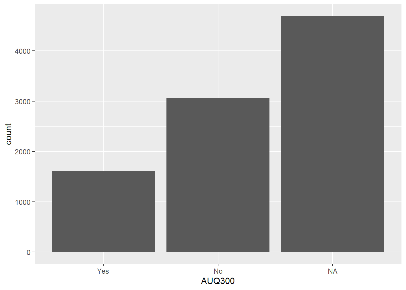
Let’s start an example from scratch using a real dataset. We examine the AUQ300 variable from the nhanes survey, which represents gun use.
We load the full dataset and clean all the relevant variables at once so the same nhanes.clean object can be used throughout this section and in the full example below.
nhanes <-read.csv("data/nhanes2012.csv")
head(nhanes)
summary(nhanes$AUQ300)
   Min. 1st Qu.  Median    Mean 3rd Qu.    Max.    NA's
  1.000   1.000   2.000   1.656   2.000   7.000    4689
AUQ300
Recode Variable if Needed
AUQ300 needs to be a factor variable with 1 equaling Yes and 2 equaling No. We use recode_factor() inside mutate().
recode_factor() transforms the levels of a categorical variable into a new set of labels.
recode() is generic and applies to numeric, categorical, or text data.
We select and recode all six variables of interest in a single pipeline so the object is ready for both the bar chart examples below and the full multi-variable example later.
nhanes.clean <- nhanes %>% dplyr::select(AUQ300, AUQ310, AUQ320, AUQ060, AUQ070, AUQ080) %>%mutate(AUQ300 =recode_factor(AUQ300, '1'='Yes', '2'='No')) %>%mutate(AUQ310 =recode_factor(AUQ310,'1'="1 to less than 100",'2'="100 to less than 1000",'3'="1000 to less than 10k",'4'="10k to less than 50k",'5'="50k or more",'7'="Refused",'9'="Don't know")) %>%mutate(AUQ060 =recode_factor(AUQ060, '1'='Yes', '2'='No')) %>%mutate(AUQ070 =recode_factor(AUQ070, '1'='Yes', '2'='No')) %>%mutate(AUQ080 =recode_factor(AUQ080, '1'='Yes', '2'='No')) %>%mutate(AUQ320 =recode_factor(AUQ320,'1'='Always', '2'='Usually','3'='About half the time', '4'='Seldom', '5'='Never'))summary(nhanes.clean)
  AUQ300                       AUQ310                     AUQ320
 Yes :1613   1 to less than 100   : 701   Always             : 583
 No  :3061   100 to less than 1000: 423   Usually            : 152
 NA's:4690   1000 to less than 10k: 291   About half the time: 123
             10k to less than 50k : 106   Seldom             : 110
             50k or more          :  66   Never              : 642
             Don't know           :  26   NA's               :7754
             NA's                 :7751
  AUQ060      AUQ070      AUQ080
 Yes :2128   Yes : 564   Yes : 159
 No  : 745   No  : 210   No  :  53
 NA's:6491   NA's:8590   NA's:9152
Get Bar Roughly Plotted
# Without piping operatorggplot(nhanes.clean, aes(x = AUQ300)) +geom_bar()
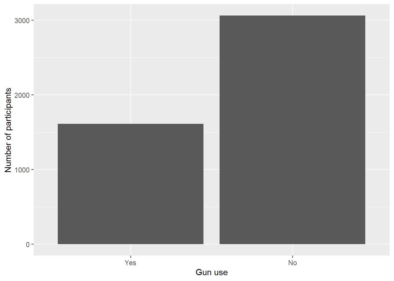
Use drop_na() to remove missing values from the variable before plotting so they do not appear as a category.
Add axis labels with labs(x = ..., y = ...).
nhanes.clean %>%drop_na(AUQ300) %>%ggplot(aes(x = AUQ300)) +geom_bar() +labs(x ="Gun use", y ="Number of participants")
From the bar graph, we can see that almost double the number of people have not fired a firearm for any reason compared to those who have.
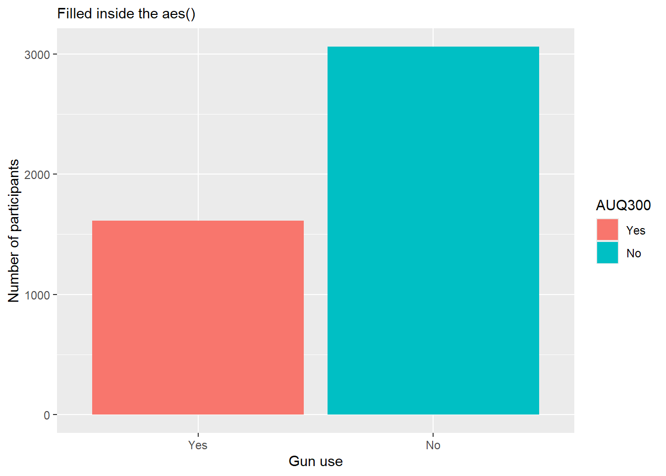
Adding Color
When fill is mapped to a variable inside aes(), ggplot assigns a distinct color to each category automatically.
nhanes.clean %>%drop_na(AUQ300) %>%ggplot(aes(AUQ300, fill=AUQ300)) +geom_bar() +labs(x ="Gun use", y ="Number of participants", subtitle ="Filled inside the aes()")
Data Prep and Then Visualized
This example walks through cleaning the gss.2016 dataset and then plotting the result, showing how data preparation and visualization connect in practice.
gss.2016<-read.csv(file ="data/gss2016.csv")
The grass variable captures whether respondents believe marijuana should be legal, but it arrives as a character and contains placeholder codes ("DK", "IAP") that need to be converted to NA. The age variable has the value "89 OR OLDER" which prevents numeric coercion. We handle all of this in a single pipeline and create an age category variable at the end.
Why droplevels() is needed here: When a factor variable is coerced from character and then values are replaced with NA using na_if(), the factor levels that no longer appear in the data are not automatically removed — they linger invisibly. This matters because any subsequent summary(), table(), or ggplot2 bar chart will still list those empty levels, creating phantom categories in output and plots. droplevels() removes any levels that have zero observations, so only the levels that actually appear in the data are retained.
gss.2016.cleaned <- gss.2016%>%mutate(grass =as.factor(grass)) %>%mutate(grass =na_if(x = grass, y ="DK")) %>%# recode "DK" → NAmutate(grass =na_if(x = grass, y ="IAP")) %>%# recode "IAP" → NAmutate(grass =droplevels(x = grass)) %>%# remove now-empty levelsmutate(age =recode(age, "89 OR OLDER"="89")) %>%mutate(age =as.numeric(x = age)) %>%mutate(age.cat =as.factor(case_when( age <30~"< 30", age >=30& age <=59~"30 - 59", age >=60& age <=74~"60 - 74", age >=75~"75+",TRUE~NA_character_ )))summary(gss.2016.cleaned)
       grass           age           age.cat
 LEGAL    :1126   Min.   :18.00   < 30   : 481
 NOT LEGAL: 717   1st Qu.:34.00   30 - 59:1517
 NA's     :1024   Median :49.00   60 - 74: 598
                  Mean   :49.16   75+    : 261
                  3rd Qu.:62.00   NA's   :  10
                  Max.   :89.00
                  NA's   :10
With the data cleaned, we can plot directly. geom_bar() counts observations automatically — no need to pre-compute frequencies. drop_na() removes missing values so they don’t appear as a bar category.
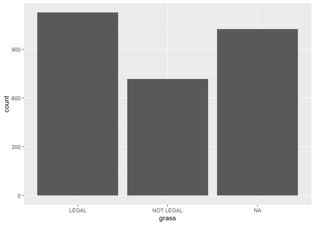
ggplot(gss.2016.cleaned, aes(grass)) +geom_bar()
gss.2016.cleaned %>%drop_na() %>%ggplot(aes(grass)) +geom_bar(fill=c("red", "blue")) +labs(x ="Should marijuana be legal", y="Frequency of Responses")
Edit The Graphic
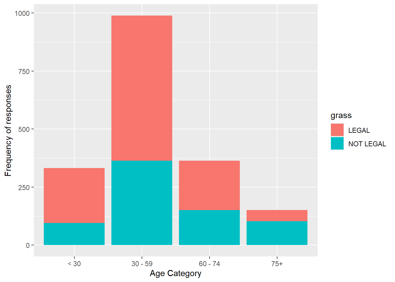
We can expand to include the age.cat variable on the x axis, with bars filled by grass category.
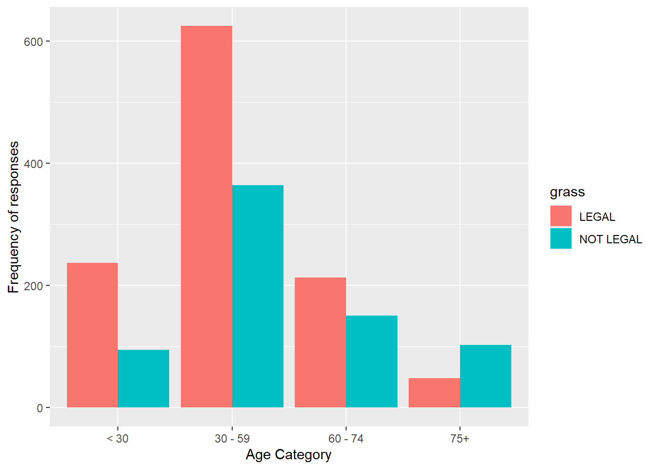
gss.2016.cleaned %>%drop_na() %>%ggplot(aes(age.cat, fill=grass)) +geom_bar() +labs(x="Age Category", y="Frequency of responses")
Add position = "dodge" to place the bars side by side (grouped) rather than stacked.
gss.2016.cleaned %>%drop_na() %>%ggplot(aes(age.cat, fill=grass)) +geom_bar(position="dodge") +labs(x="Age Category", y="Frequency of responses")
We can further edit to show percentages on the y axis using after_stat(count).
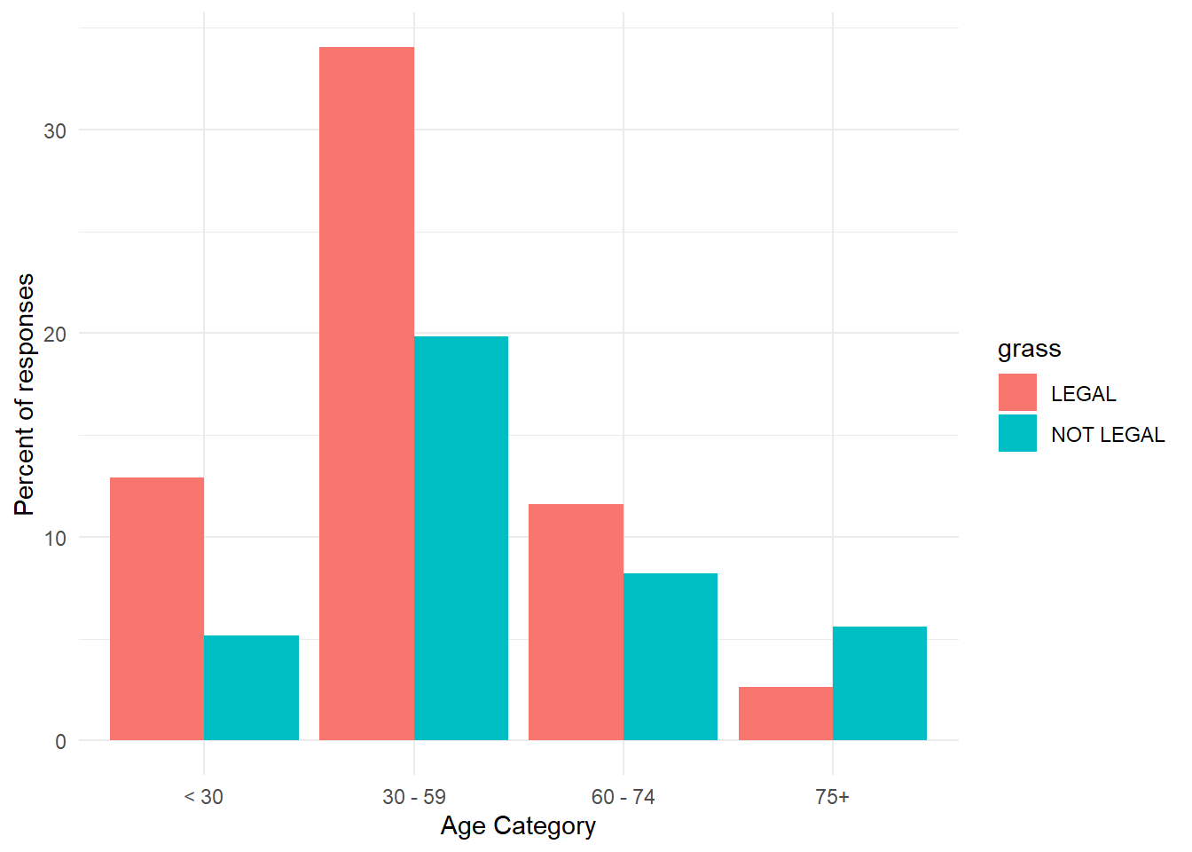
gss.2016.cleaned %>%drop_na() %>%ggplot(aes(age.cat, y =100*(after_stat(count))/sum(after_stat(count)), fill=grass)) +geom_bar(position ='dodge')+theme_minimal()+labs(x ="Age Category",y ="Percent of responses")
MultiVariable Data Visualization
Now that we can clean and prepare data, we can start to visualize it. The goals of this section are to explore patterns based on groups or between two or more variables. Visualization is one of the most important steps in any analysis — it helps you understand your data quickly, catch problems early, and communicate findings clearly.
Histograms, density plots, and boxplots for a single continuous variable were covered in the Descriptive Statistics lesson, and single-variable bar charts requiring data preparation are in the section above. This section focuses entirely on two-variable charts: grouped and stacked bar charts for two categorical variables, boxplots across groups, and scatterplots for two continuous variables.
library(tidyverse)
Note
Recall that ggplot2 builds charts in layers using + — each layer adds a geometry, label, or theme on top of the last. The same layering concepts from the Descriptive Statistics lesson apply to every chart in this section.
Combinations of 2 variable types for graphing:
Two categorical / factor variables.
One categorical / factor and one continuous / numeric variable.
Two continuous / numeric variables.
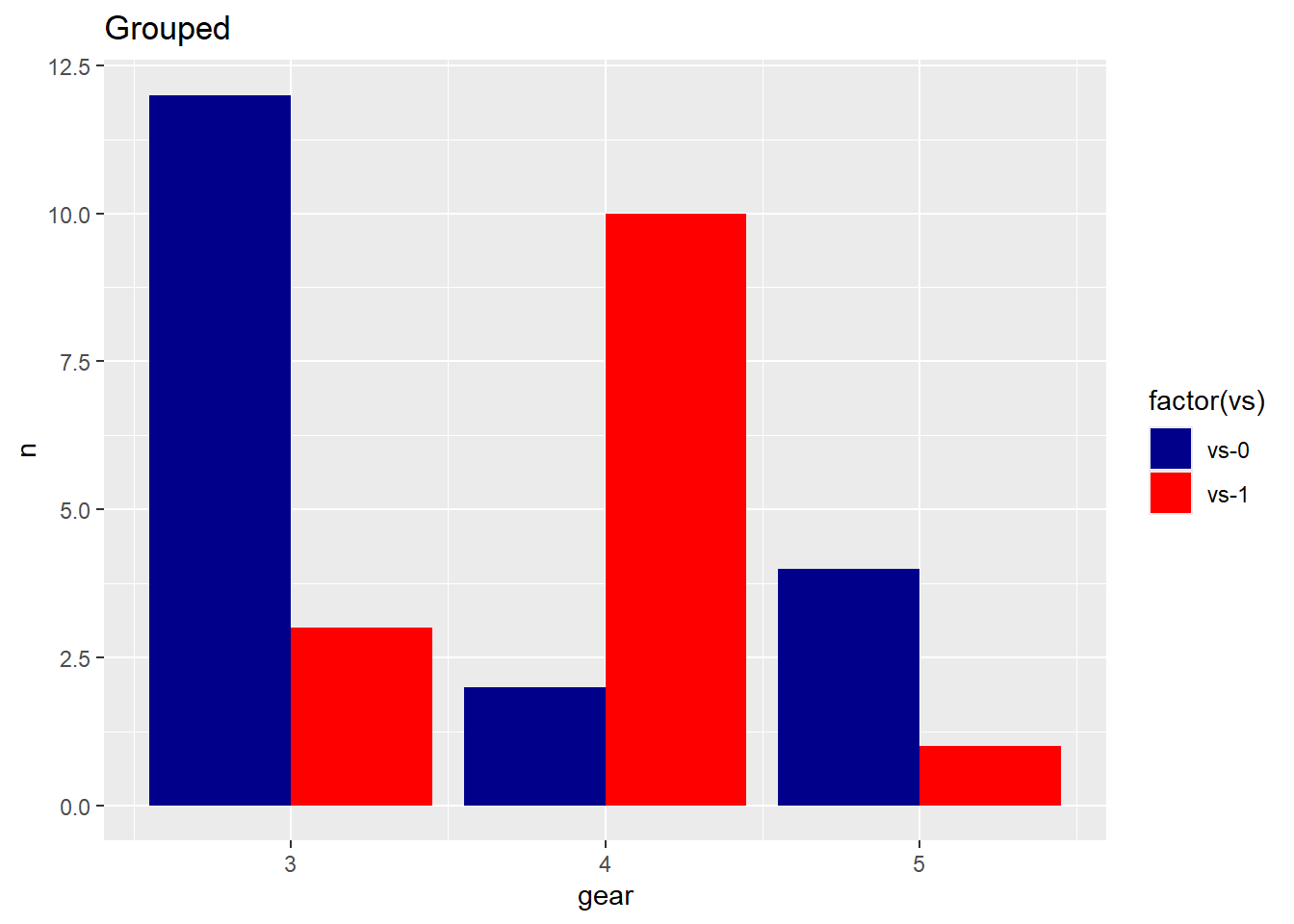
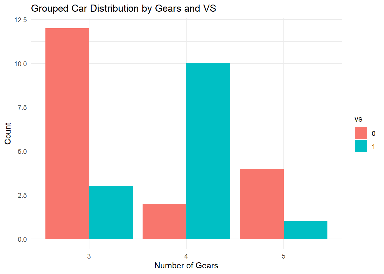
Bar Graphs for Two Categorical Variables
There are two formats available: Grouped and Stacked.
 vs    gear        n
 0:3   3:2   Min.   : 1.000
 1:3   4:2   1st Qu.: 2.250
       5:2   Median : 3.500
             Mean   : 5.333
             3rd Qu.: 8.500
             Max.   :12.000
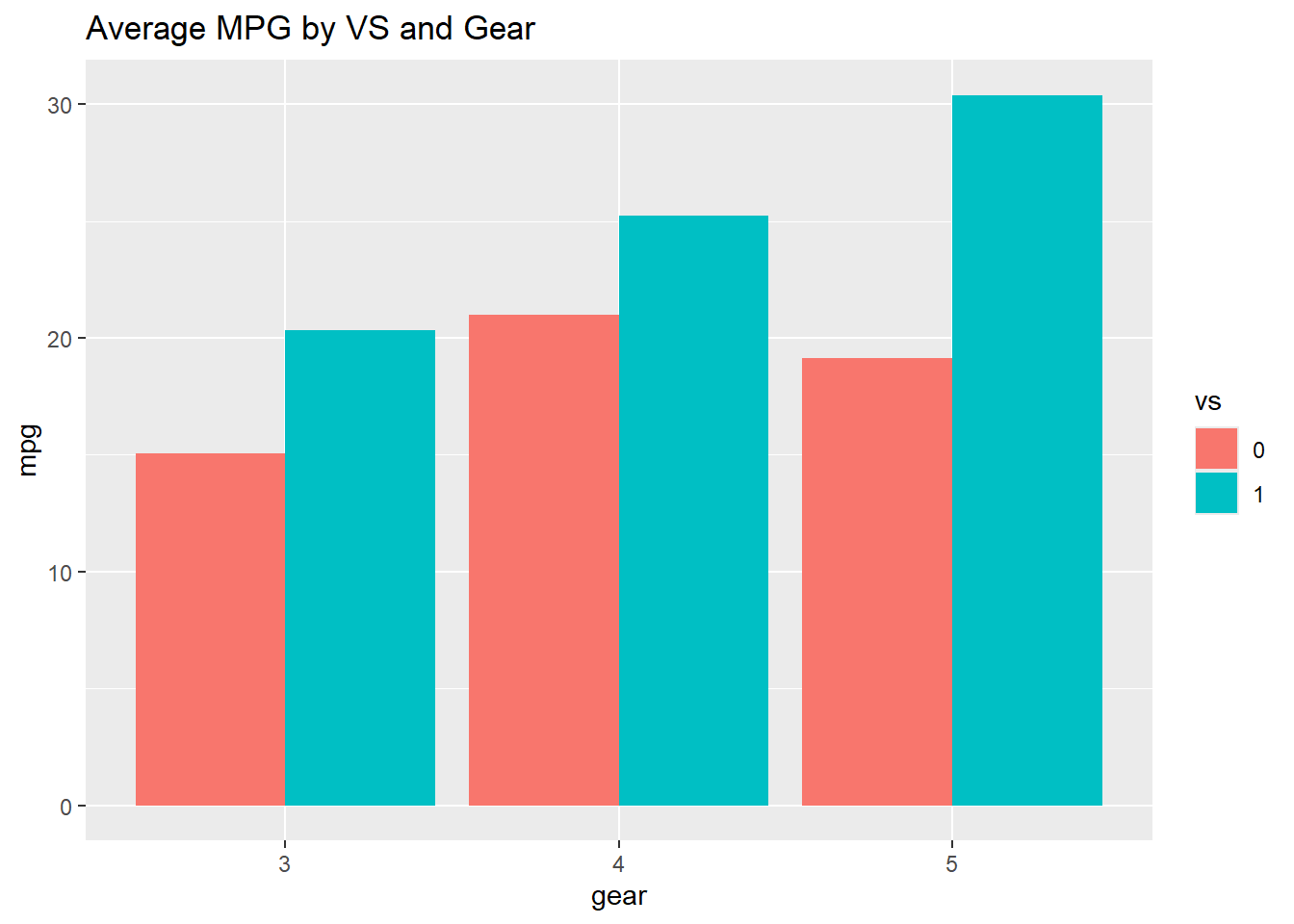
ggplot(countsDF, aes(x = gear, y = n, fill = vs)) +geom_bar(stat ="identity", position ="dodge") +labs(title ="Grouped Car Distribution by Gears and VS",x ="Number of Gears", y ="Count") +theme_minimal()
Stacked Bar Graph
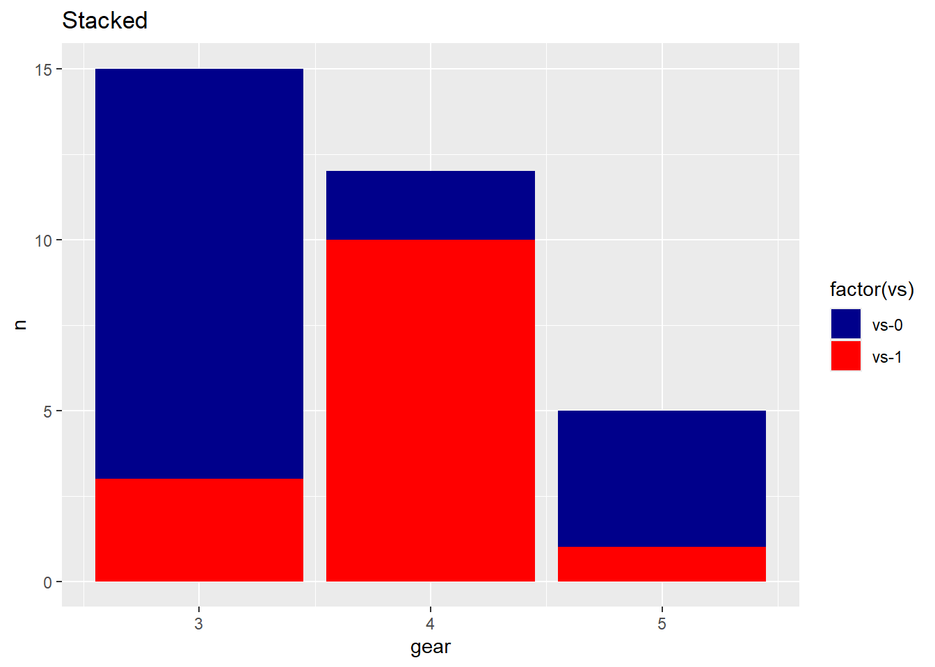
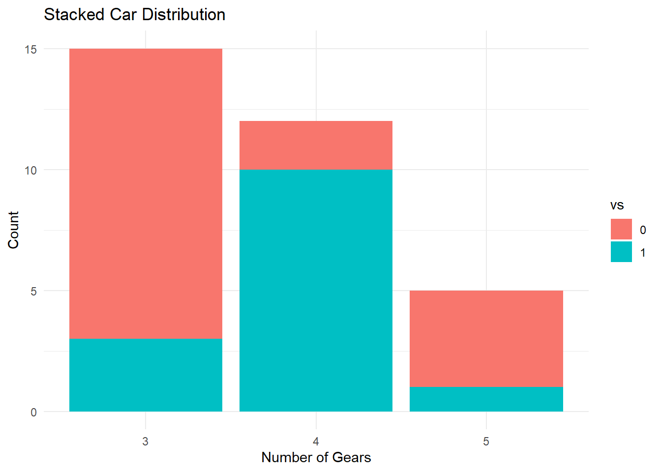
A stacked bar graph extends the standard bar chart to two categorical variables by dividing each bar into sub-bars, one per level of the second variable.
Remove the position = "dodge" argument to stack instead of group.
ggplot(countsDF, aes(x = gear, y = n, fill = vs)) +geom_bar(stat ="identity") +labs(title ="Stacked Car Distribution",x ="Number of Gears",y ="Count") +theme_minimal()
Bar Graph for Continuous Across Groups
Instead of counting observations, we can display a continuous variable (like mean) for each group.
Use group_by() and summarise() to calculate the group statistic first, then pass it to geom_bar(stat = "identity").
ggplot(avg_mpg, aes(gear, mpg, fill = vs)) +geom_bar(stat ="identity", position ="dodge") +ggtitle("Average MPG by VS and Gear")
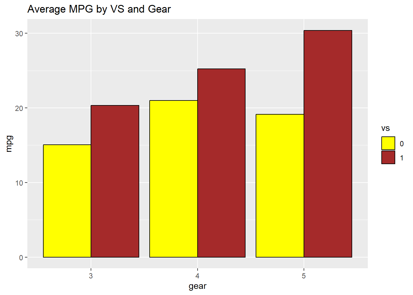
ggplot(avg_mpg, aes(gear, mpg, fill = vs)) +geom_bar(stat ="identity", position ="dodge", color="black") +ggtitle("Average MPG by VS and Gear")+scale_fill_manual(values=c("yellow", "brown"))
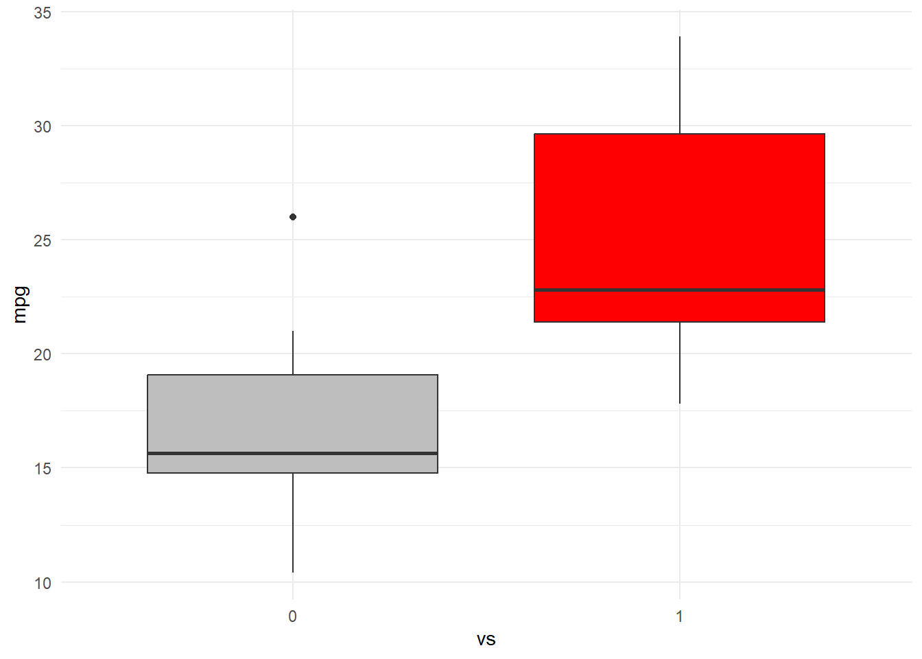
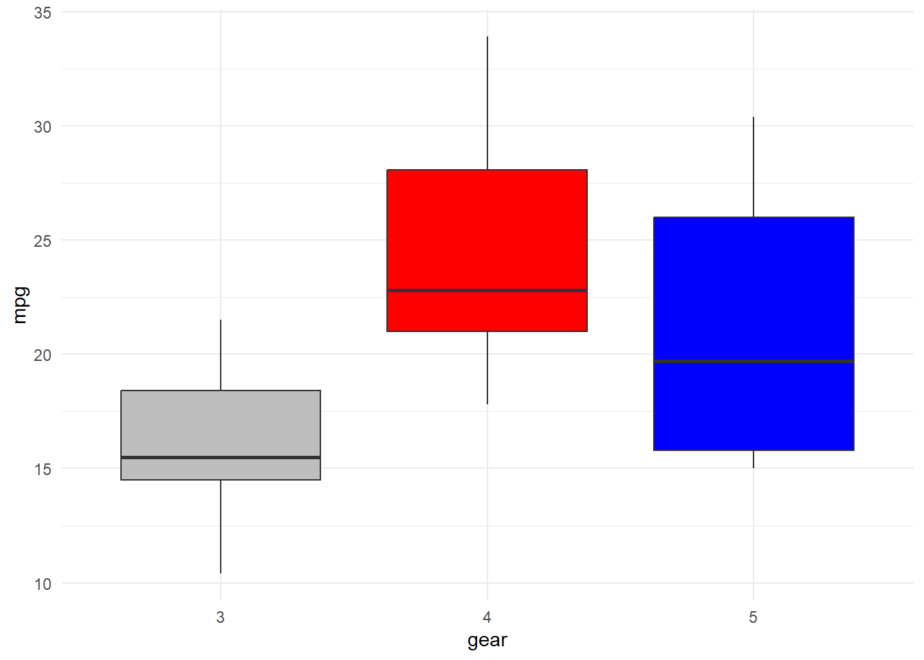
Boxplot for Continuous Across Groups
When a grouping variable is added to a boxplot, we get one boxplot per group. This allows direct comparison of distributions across categories.
The categorical variable must be a factor before plotting.
mtcars %>%ggplot(aes(x = gear, y = mpg, fill = gear)) +geom_boxplot(show.legend =FALSE) +scale_fill_manual(values =c("gray", "red", "blue")) +theme_minimal()
mtcars %>%ggplot(aes(x = vs, y = mpg, fill = vs)) +geom_boxplot(show.legend =FALSE) +scale_fill_manual(values =c("gray", "red")) +theme_minimal()
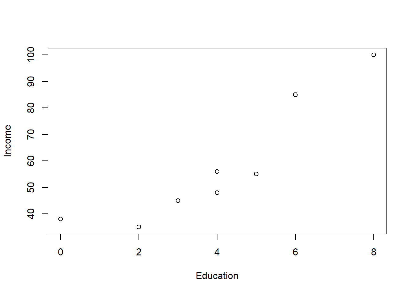
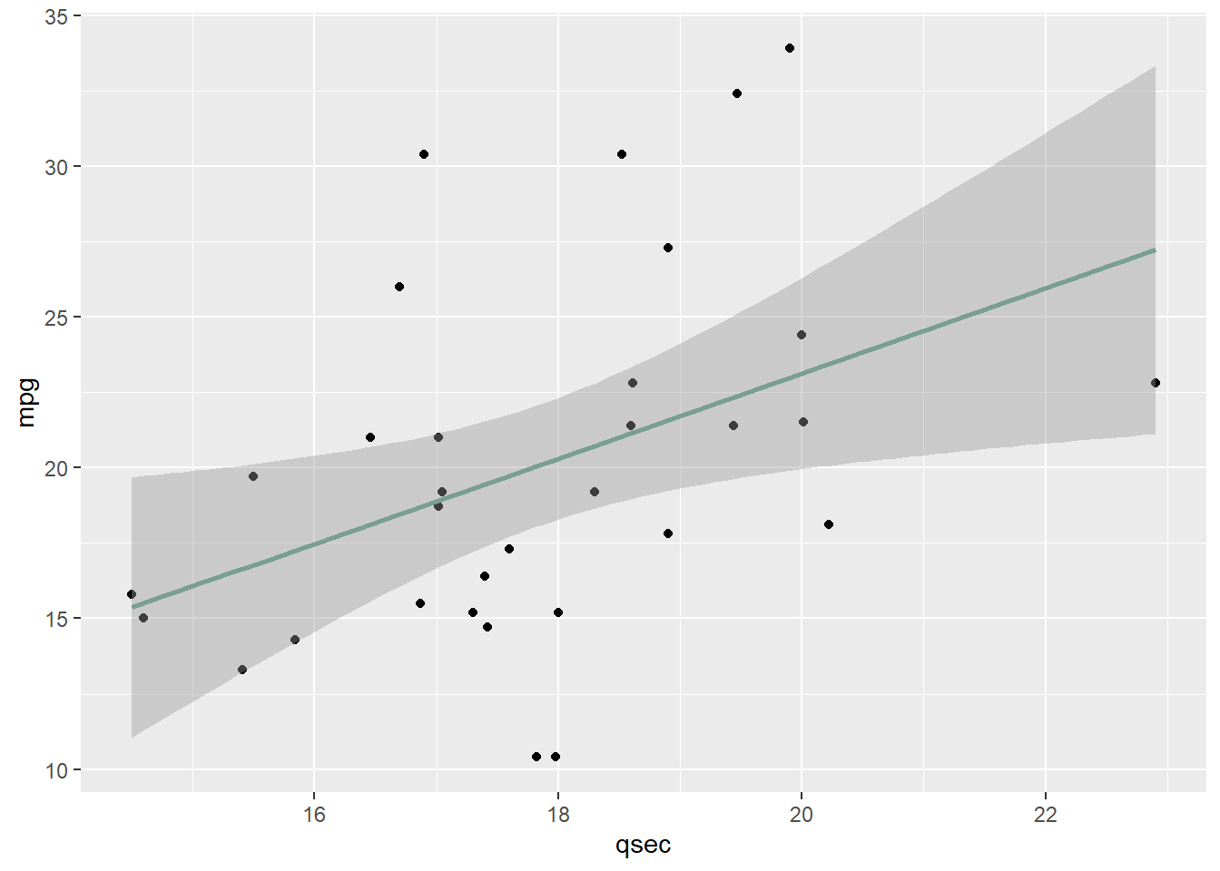
Scatterplot for Two Continuous Variables
A scatterplot is used to determine if two continuous variables are related.
Each point is a pairing: \((x_1, y_1), (x_2, y_2),\) etc.
Our goal with a scatterplot is to characterize the relationship visually — positive, negative, or not existent.
ScatterPlot Results
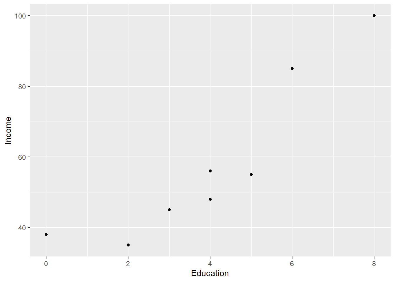
Let’s work a clean example examining the relationship between income and years of education.
Edu <-read.csv("data/education.csv")plot(Edu$Income ~ Edu$Education, ylab ="Income", xlab ="Education")
Working with ggplot:
Layer 1: ggplot() with aes() pointing to x and y variables.
Layer 2: geom_point() to add the observation points.
Additional layers: labs(), geom_smooth(), and others.
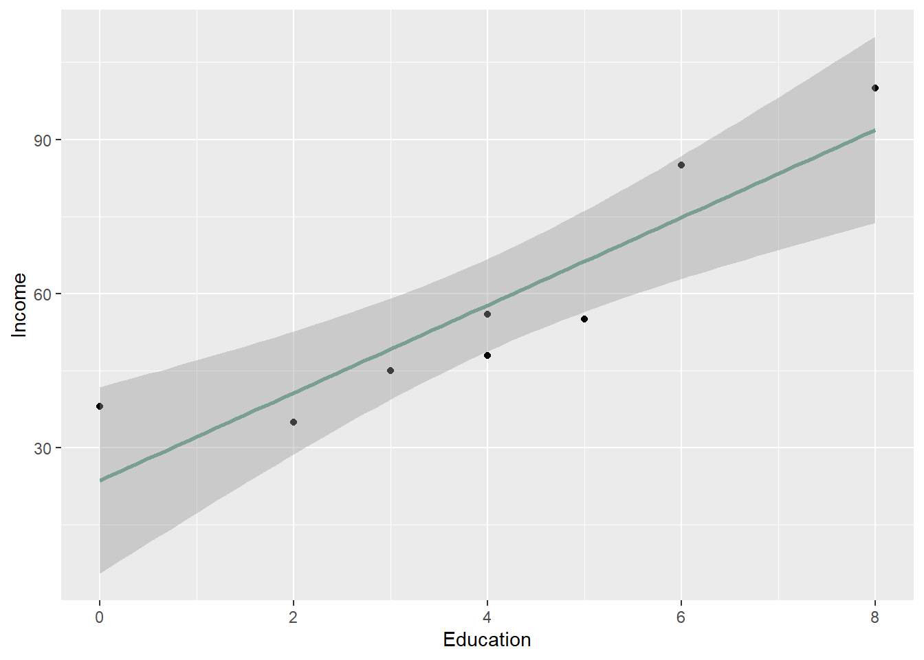
ggplot(Edu, aes(x=Education, y=Income)) +geom_point() +labs(y="Income", x ="Education")
We can add a trendline using geom_smooth(method = "lm") to fit a linear regression line and visualize the direction of the relationship.
ggplot(Edu, aes(x=Education, y=Income)) +geom_point() +labs(y="Income", x ="Education") +geom_smooth(method="lm", color="#789F90")
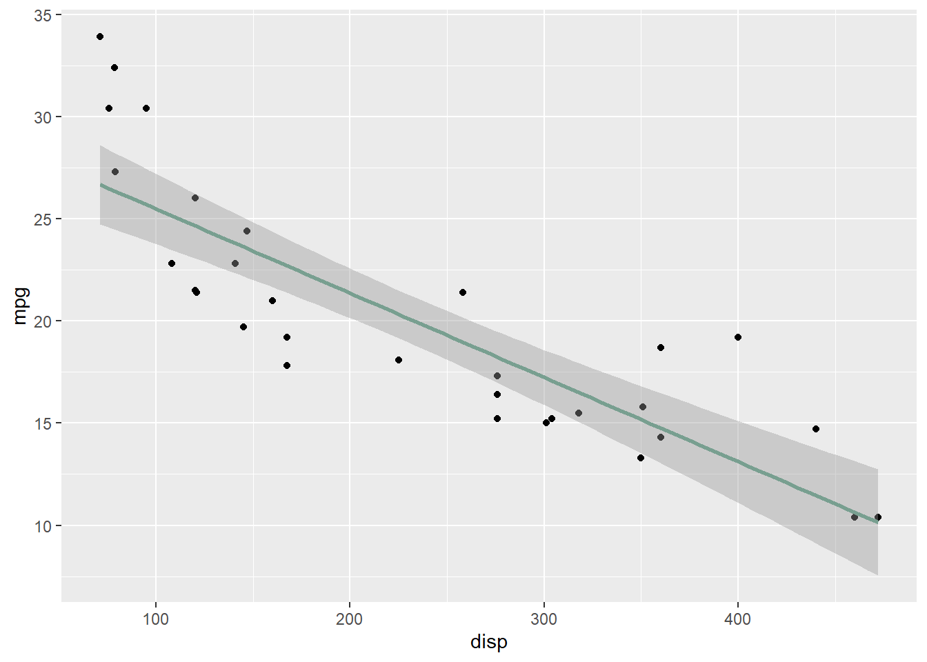
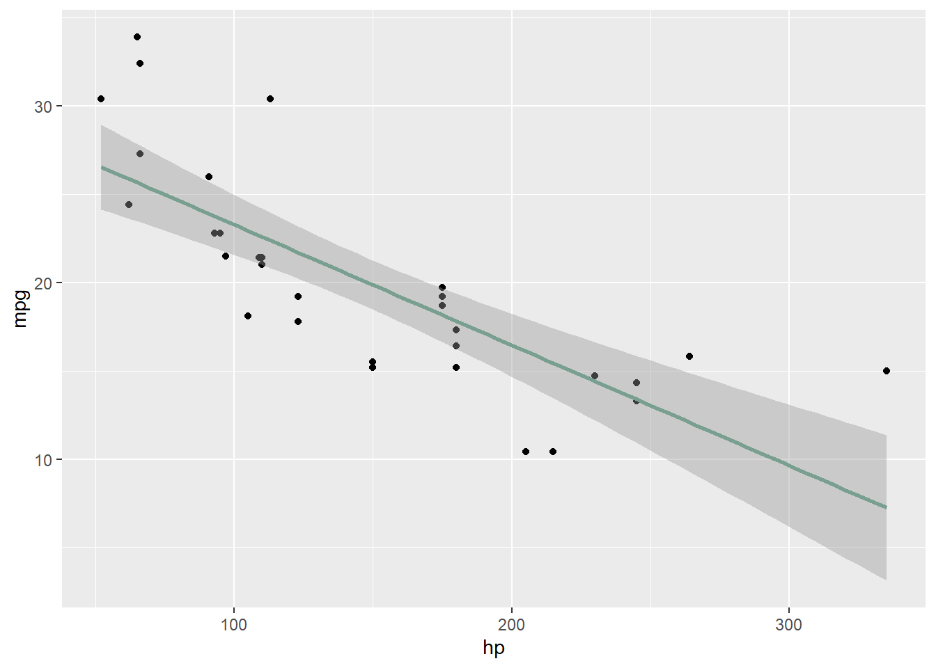
Let’s look at a few more examples using mtcars and see if the relationship is positive, negative, or not existent.
When one of the variables is categorical rather than continuous, a boxplot is more appropriate than a scatterplot. If cyl is treated as numeric, only one boxplot appears. Converting it to a factor fixes this.
The following examples tie together data preparation and visualization using two real public health datasets. Each one requires cleaning before plotting — the nhanes dataset uses numeric codes that need recoding, and the BRFSS dataset has sentinel values that must be converted to NA before the distributions make sense.
nhanes Dataset example
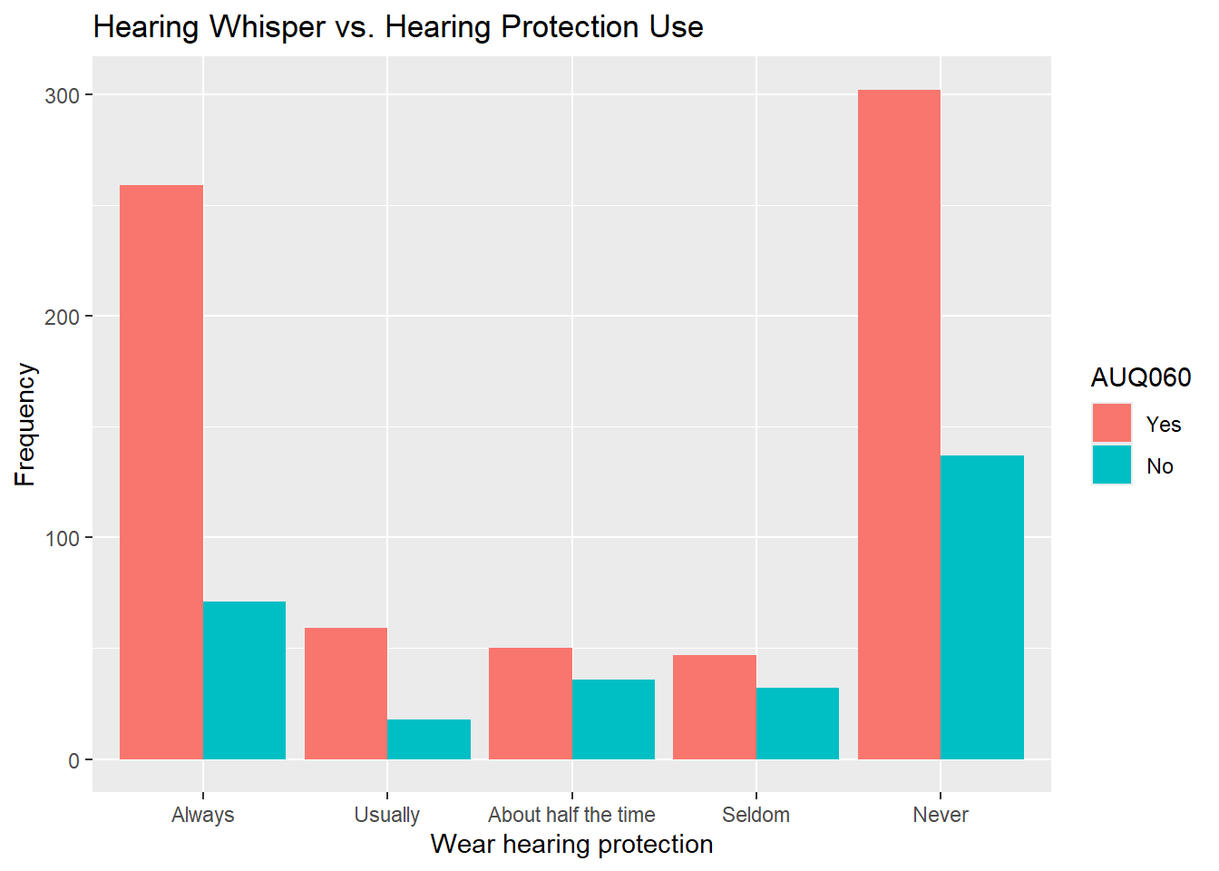
The nhanes dataset includes auditory health variables alongside gun use variables, making it an interesting case for exploring relationships between two categorical variables.
Variables: AUQ060/070/080 measure ability to hear across a room; AUQ300/310/320 relate to firearm use and hearing protection.
nhanes.clean was fully prepared in the Bar Graph with Data Wrangling section above with all six variables recoded and ready to use.
NA values are left in and handled on a chart-by-chart basis using drop_na() so we do not unnecessarily reduce the dataset.
nhanes.clean %>%drop_na(AUQ310) %>%drop_na(AUQ060) %>%ggplot(aes(x=AUQ310, fill=AUQ060)) +geom_bar(position="dodge") +labs(x="How many rounds fired", title="Hearing Whisper vs. Rounds Fired", y="Frequency")
Try running the other variable combinations on your own to see what patterns you can find.
brfss Dataset Example
The BRFSS (Behavioral Risk Factor Surveillance System) dataset illustrates how data preparation and visualization come together. The qualitative variable TRNSGNDR requires coercion and recoding before it can be plotted; the continuous variable PHYSHLTH needs its sentinel codes cleaned before analysis. This example ties together the coercion, mutate(), and visualization skills from this lesson.
The full codebook where this screenshot is taken is brfss_2014_codebook.pdf.
Evaluate CodeBook Before Making Decisions
brfss <-read.csv("data/brfss.csv")summary(brfss)
    TRNSGNDR        X_AGEG5YR          X_RACE         X_INCOMG
 Min.   :1.000    Min.   : 1.000   Min.   :1.000   Min.   :1.000
 1st Qu.:4.000    1st Qu.: 5.000   1st Qu.:1.000   1st Qu.:3.000
 Median :4.000    Median : 8.000   Median :1.000   Median :5.000
 Mean   :4.059    Mean   : 7.822   Mean   :1.992   Mean   :4.481
 3rd Qu.:4.000    3rd Qu.:10.000   3rd Qu.:1.000   3rd Qu.:5.000
 Max.   :9.000    Max.   :14.000   Max.   :9.000   Max.   :9.000
 NA's   :310602                    NA's   :94
    X_EDUCAG        HLTHPLN1         HADMAM          X_AGE80
 Min.   :1.000   Min.   :1.000   Min.   :1.000    Min.   :18.00
 1st Qu.:2.000   1st Qu.:1.000   1st Qu.:1.000    1st Qu.:44.00
 Median :3.000   Median :1.000   Median :1.000    Median :58.00
 Mean   :2.966   Mean   :1.108   Mean   :1.215    Mean   :55.49
 3rd Qu.:4.000   3rd Qu.:1.000   3rd Qu.:1.000    3rd Qu.:69.00
 Max.   :9.000   Max.   :9.000   Max.   :9.000    Max.   :80.00
                                 NA's   :208322
    PHYSHLTH
 Min.   : 1.0
 1st Qu.:20.0
 Median :88.0
 Mean   :61.2
 3rd Qu.:88.0
 Max.   :99.0
 NA's   :4
Qualitative Variable
To look at an example, the one below seeks to understand the healthcare issue in reporting gender based on different definitions. The dataset is part of the Behavioral Risk Factor Surveillance System (brfss) dataset (2014), which includes lots of other variables besides reported gender.
#Summarize the TRNSGNDR variablesummary(object = brfss$TRNSGNDR)
   Min. 1st Qu.  Median    Mean 3rd Qu.    Max.    NA's
  1.000   4.000   4.000   4.059   4.000   9.000  310602
#Find frequencies
table(brfss$TRNSGNDR)
     1      2      3      4      7      9
   363    212    116 150765   1138   1468
Since this table is not very informative, we need to do some edits.
Check the class of the variable to see the issue with analyzing it as a categorical variable.
class(brfss$TRNSGNDR)
[1] "integer"
Because TRNSGNDR is stored as numeric, it needs to be converted to a factor before recoding. The mutate() pipeline below handles the coercion and recoding in a single step.
brfss.cleaned <- brfss %>%mutate(TRNSGNDR =as.factor(TRNSGNDR)) %>%mutate(TRNSGNDR =recode_factor(TRNSGNDR,'1'='Male to female','2'='Female to male','3'='Gender non-conforming','4'='Not transgender','7'='Not sure','9'='Refused'))
We can use the levels() command to show the factor levels made with the mutate() command above.
levels(brfss.cleaned$TRNSGNDR)
[1] "Male to female"        "Female to male"        "Gender non-conforming"
[4] "Not transgender"       "Not sure"              "Refused"
Check the summary.
summary(brfss.cleaned$TRNSGNDR)
       Male to female        Female to male Gender non-conforming
                  363                   212                   116
      Not transgender              Not sure               Refused
               150765                  1138                  1468
                 NA's
               310602
Take a good look at the table to interpret the frequencies in the output above. The highest percentage was the “NA’s” category, followed by “Not transgender”. Removing the NA’s moved the “Not transgender” category to over 97% of observations.
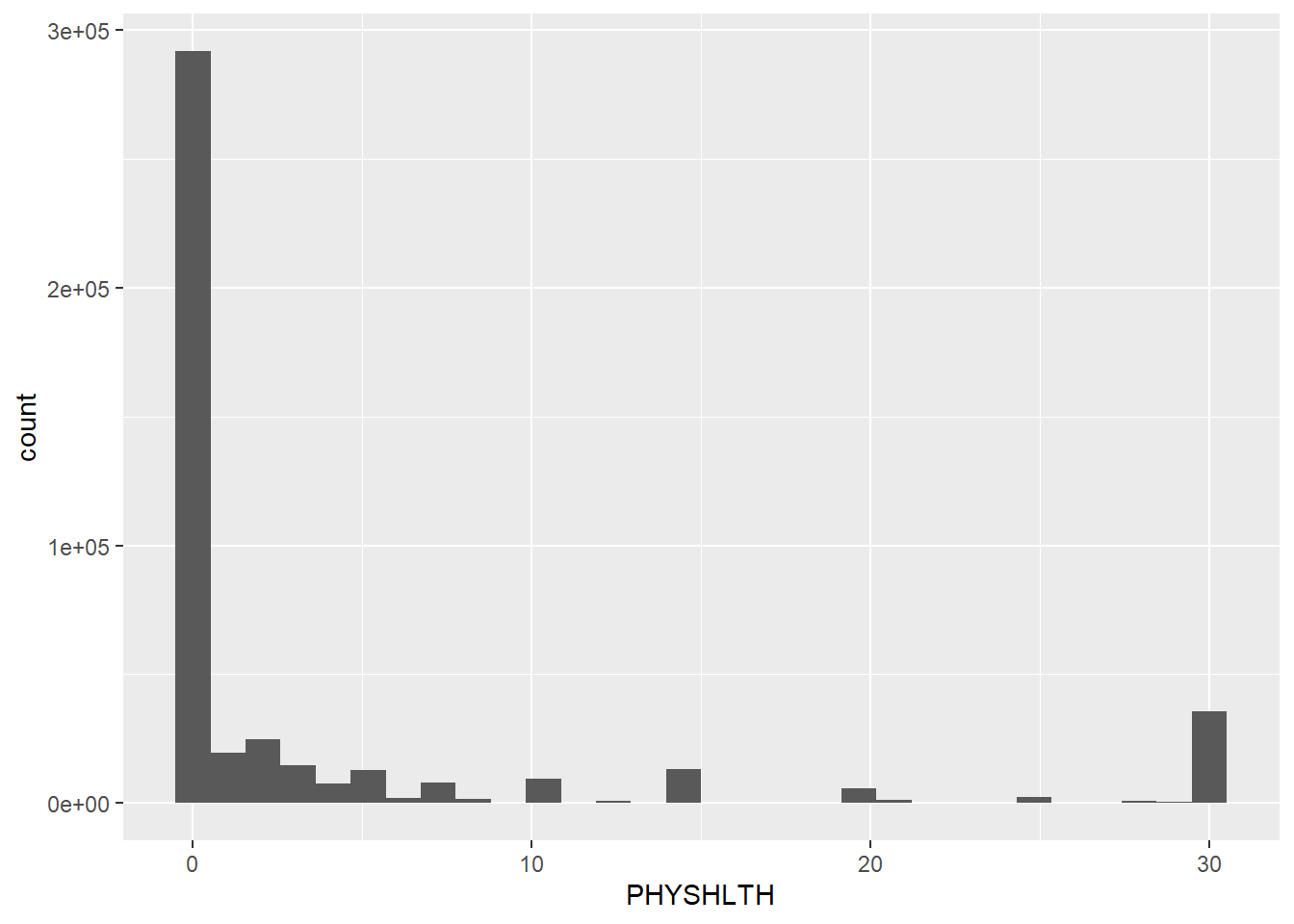
Quantitative Variable
Let’s use the cleaned dataset to make more changes to the continuous variable PHYSHLTH. In the codebook, it looks like the data is most applicable to the first 2 categories. The 1-30 days coding and the 88 coding, which means 0 days of physical illness and injury.
Using cleaned data, we need to prep the variable a little more before getting an accurate plot.
Specifically, we need to null out the 77 and 99 values and make sure the 88 coding is set to be 0 for 0 days of illness and injury.
brfss.cleaned <- brfss %>%mutate(TRNSGNDR =recode_factor(TRNSGNDR,'1'='Male to female','2'='Female to male','3'='Gender non-conforming','4'='Not transgender','7'='Not sure','9'='Refused')) %>%#Turn the 77 values to NA's. mutate(PHYSHLTH =na_if(PHYSHLTH, y =77)) %>%#Turn the 99 values to NA's. mutate(PHYSHLTH =na_if(PHYSHLTH, y =99)) %>%#Recode the 88 values to be numeric value of 0. mutate(PHYSHLTH =recode(PHYSHLTH, '88'=0L))
Histogram
The histogram showed most people have between 0 and 10 unhealthy days per 30 days.
Next, evaluate mean, median, and mode for the PHYSHLTH variable after ignoring the blanks.
library(semTools)# Plot the databrfss.cleaned %>%ggplot(aes(PHYSHLTH)) +geom_histogram()
# Calculate Skewness and Kurtosisskew(brfss.cleaned$PHYSHLTH)
skew (g1)        se         z         p
    2.209     0.004   607.905     0.000
kurtosis(brfss.cleaned$PHYSHLTH)
Excess Kur (g2)              se               z               p
          3.474           0.007         478.063           0.000
The skew results provide a z of 607.905 (6.079054e+02) which is much higher than 7 (for large datasets). This indicates a clear right skew which means the data is not normally distributed.
The kurtosis results are also very leptokurtic with a score of 478.063.
Review and Practice
Using AI
Use the following prompts in our chatbot below to explore more about data preparation and visualization with ggplot2 further.
Understanding data preparation concepts:
What is the difference between na.omit() and drop_na() in R? When would removing rows with missing values introduce analytical bias, and what is an alternative approach?
Explain the difference between filter(), select(), and mutate() in dplyr. Write an example of each using a customer dataset with columns for CustomerID, Region, Age, and AnnualSpend.
What does the pipe operator %>% do in R, and why does it make dplyr code more readable? Show an example of the same operation written with and without the pipe.
When using group_by() with summarize(), how do you decide which grouping variable to use? Give an example where the grouped result changes the business interpretation compared to the overall summary.
Prompting AI effectively for data preparation tasks:
AI can write dplyr pipelines quickly and correctly — but only if you give it enough context. A vague prompt produces generic code that may not match your dataset, your variable names, or your analytical goal. Specificity is the single most important lever. The table below shows the same request written two ways.
Tip
Four things that make a data prep prompt specific:
Name the dataset and the variable — gig$Industry, not “my categorical column”
Name the function you expect — as.factor(), drop_na(), group_by()
State what the output should look like — “return a tibble with one row per Industry”
Tell AI what to check — “run summary() afterward and flag any remaining NAs”
Vague prompt
Specific prompt
“Clean my data”
“In my customer_data dataframe, coerce PurchaseDate to Date using as.Date(), recode Region from numeric (1, 2, 3) to factor with levels East, West, Central using mutate() and recode(), and use drop_na(AnnualSpend) to remove rows where the outcome variable is missing. Then run summary() and report any remaining type mismatches.”
“Summarize by group”
“Using group_by() and summarize(), calculate the mean, median, and count of AnnualSpend broken out by Region and Churned in customer_data. Arrange the output from highest to lowest mean spend.”
“Fix missing values”
“In customer_data, identify which columns have missing values using sum(is.na()) applied to each column. For AnnualSpend, impute missing values with the column median. For Region, print the rows with missing values so I can review them before deciding whether to remove or impute.”
“Recode this variable”
“In the gig dataset, use mutate() and case_when() to create a new factor variable WageTier: ‘Low’ for Wage < 32, ‘Mid’ for 32 ≤ Wage < 44, ‘High’ for Wage ≥ 44. Then run table(gig$WageTier) to confirm the counts.”
Warning
After AI generates code, always: (1) run it, (2) check the output matches your expectation, (3) verify the logic is analytically sound — not just syntactically correct. AI will not warn you if a cleaning step introduces bias.
Visualization prompts:
How can I modify the appearance of a ggplot bar chart to include custom colors for each bar, and what are the best practices for choosing colors in data visualization?
What is the role of layering in ggplot, and how can adding multiple layers, such as labels, themes, and lines, improve the readability of a plot?
When should a density plot be used instead of a histogram, and how does each visualization help in understanding the distribution of continuous data?
How can I use a boxplot in R to identify and visualize outliers in my dataset, and what additional steps should I take to handle these outliers?
How can I create a scatter plot in ggplot to explore relationships between two continuous variables, and how do I add a trendline to help interpret the results?
What are the steps for creating a grouped bar chart in ggplot, and how does this visualization help in comparing multiple categories or groups within a dataset?
Data Types and Coercion Lab
1. What R function would you use to check the data type of a column? Write the command to check the type of the Age column in a dataset called survey.
Show Answer
class(survey$Age)
2. A dataset has a Rating column stored as character with values "1", "2", "3". Write the code to convert it to numeric.
3. An instructor evaluation column contains "excellent", "good", "fair", "poor". Write a mutate() pipeline using recode() to convert these to 4, 3, 2, 1 respectively and store them as integers.
4. Load dataprep.csv as houseprices. The BuildDay column contains dates stored as character strings (e.g., "1986-08"). Use the lubridate package to convert it to a proper date type, then confirm the conversion with class().
# Your code here
Show Answer
library(lubridate)houseprices <-read.csv("data/dataprep.csv")houseprices$BuildDay <-ym(houseprices$BuildDay) # "1986-08" is year-month formatclass(houseprices$BuildDay) # "Date"head(houseprices$BuildDay)
ym() parses year-month formatted strings. After conversion, BuildDay is a proper Date column that R can sort, filter, and compute differences on correctly.
5. Load gig.csv using read.csv() with stringsAsFactors = TRUE and na.strings = "". Run str() on the result. List every variable, its type as R loaded it, and whether the type is correct for what the variable represents.
Expected output will vary, but the evaluation follows this logic:
Variable
Type R assigned
Correct?
Notes
EmployeeID
integer
✅
Whole-number ID — integer is fine
Industry
factor
✅
Categorical — factor is correct
Job
factor
✅
Categorical — factor is correct
Wage
numeric
✅
Continuous measurement — numeric is correct
Any variable showing chr that represents a category needs as.factor(). Any numeric field that loaded as chr needs as.numeric() — always check for NAs introduced by coercion.
6. Using the gig dataset, identify the total number of missing values in the entire dataset, then count the missing values in the Wage column specifically. Use two different approaches for the column count.
Show Answer
# Total NAs in the entire datasetsum(is.na(gig))# NAs in Wage — approach 1: sum of logical vectorsum(is.na(gig$Wage))# NAs in Wage — approach 2: count rows where Wage is NAnrow(gig[is.na(gig$Wage), ])
is.na() returns TRUE for each missing value. sum() treats TRUE as 1 and FALSE as 0, so the total is a count of NAs. Both approaches for Wage give the same answer — the first is more concise, the second makes the filtering logic explicit.
7. Load gss2016.csv. Fix the two known type problems: coerce grass to a factor, and recode "89 OR OLDER" in the age column to "89" before converting age to numeric. Confirm both fixes with class().
Show Answer
gss.2016<-read.csv("data/gss2016.csv")# Fix 1: grass should be a factor, not charactergss.2016$grass <-as.factor(gss.2016$grass)class(gss.2016$grass) # "factor"# Fix 2: age has a text entry that blocks numeric coerciongss.2016$age <-recode(gss.2016$age, "89 OR OLDER"="89")gss.2016$age <-as.numeric(gss.2016$age)class(gss.2016$age) # "numeric"
Why does the order matter for age? as.numeric() cannot convert "89 OR OLDER" — it would return NA and you would silently lose data. Recoding first, then converting, preserves the value. Always check sum(is.na(gss.2016$age)) afterwards to confirm no NAs were introduced unexpectedly.
8. The three strategies for handling missing data are omit, impute, and ignore. For each scenario below, identify the most appropriate strategy and explain why.
A survey dataset has 2 rows out of 500 with missing income values. The analysis does not focus on income specifically.
A clinical dataset tracks pregnancy-related complications. The variable “number of previous pregnancies” is missing for all male patients.
You are computing the mean satisfaction score for a customer survey. A few respondents left the question blank.
Show Answer
a. Ignore (or omit). With only 2 missing rows out of 500 and income not being the focus, using na.rm = TRUE when income appears in calculations is sensible. Omitting those 2 rows entirely would also be defensible — the impact on results is negligible.
b. Neither omit nor impute — investigate first. Removing all male rows would introduce severe selection bias, distorting the entire analysis. The missing values are systematically missing (not random) and the variable may simply not apply to part of the population. The right approach is to understand the data structure and consider whether this variable should be included at all, or whether a subset analysis is more appropriate.
c. Ignore with na.rm = TRUE. For a straightforward mean calculation, mean(data$satisfaction, na.rm = TRUE) is appropriate. The missing values represent non-responses, which are common in surveys. If a large proportion of responses were missing, further investigation would be warranted — but for a few blanks, na.rm is the practical and defensible choice.
Using dplyr Lab
Use the dataprep.csv dataset loaded as houseprices.
houseprices <-read.csv("data/dataprep.csv")
1. Filter the dataset to show only houses with 5 or more bedrooms. Save the result as filtered and count the observations.
1. Create a new categorical variable called HouseSizeCategory using case_when(): - Small: Sqft < 2000 - Medium: Sqft between 2000 and 3000 (inclusive) - Large: Sqft > 3000
For this lab, switch to the dataviz.csv coffee dataset rather than the datasets used in the teaching examples above. Load it as coffee. It contains 1,311 coffee quality reviews with variables including Country.of.Origin, Processing.Method, TotalScore, Flavor, and Aroma, among others. Use the scores vector for the outlier question.
coffee <-read.csv("data/dataviz.csv")
1. Create a bar chart showing the count of reviews by Country.of.Origin. Because many countries appear, filter to the top 6 countries first using dplyr. Give it a custom fill color and a theme_minimal(). What do you observe?
Show Answer
library(tidyverse)top6 <- coffee %>%count(Country.of.Origin, sort =TRUE) %>%slice_head(n =6) %>%pull(Country.of.Origin)coffee %>%filter(Country.of.Origin %in% top6) %>%ggplot(aes(x =reorder(Country.of.Origin, -table(Country.of.Origin)[Country.of.Origin]),fill = Country.of.Origin)) +geom_bar(show.legend =FALSE) +theme_minimal() +labs(title ="Coffee Reviews by Country (Top 6)",x ="Country", y ="Number of Reviews")
Mexico leads with 236 reviews, followed by Colombia (183) and Guatemala (181). The distribution is right-skewed — a few countries dominate the dataset.
2. Make a density plot of TotalScore. Add a vertical dashed line at the mean. Then run skew() and kurtosis() from semTools. Is TotalScore skewed? Does the visual agree with the statistics?
Show Answer
# Filter out the extreme low values (data quality issue — a few scores near 0)coffee_clean <-filter(coffee, TotalScore >50)ggplot(coffee_clean, aes(x = TotalScore)) +geom_density(fill ="steelblue", alpha =0.5) +geom_vline(aes(xintercept =mean(TotalScore)), color ="red", linetype ="dashed") +labs(title ="Density Plot of Coffee Total Score", x ="Total Score")library(semTools)skew(coffee_clean$TotalScore)kurtosis(coffee_clean$TotalScore)
TotalScore is left-skewed — the mean (≈82.2) is slightly below the median (≈82.5), and the distribution has a longer tail to the left. The density plot will show the peak shifted right with a tail extending left.
3. Make a boxplot of TotalScore (using coffee_clean). Do any outliers appear? Then use the scores vector below to manually verify outlier detection using the IQR method.
The TotalScore boxplot will show outliers at the low end — a handful of very low scores (the data quality issues) appear as individual points well below the whisker.
4. Create three different charts using the coffee dataset (or coffee_clean). Try at least one chart type not yet used in this lab. Write your three commands below and note what each reveals.
Show Answer
Many correct answers are possible. For example:
# Histogram of Flavor scoresggplot(coffee_clean, aes(Flavor)) +geom_histogram(binwidth =0.1, fill ="goldenrod", color ="white") +labs(title ="Distribution of Flavor Scores")# Bar chart of Processing Methodcoffee %>%filter(Processing.Method !="") %>%ggplot(aes(x = Processing.Method, fill = Processing.Method)) +geom_bar(show.legend =FALSE) +theme_minimal() +labs(title ="Reviews by Processing Method", x ="Method", y ="Count") +theme(axis.text.x =element_text(angle =30, hjust =1))# Scatterplot of Aroma vs Flavorggplot(coffee_clean, aes(x = Aroma, y = Flavor)) +geom_point(alpha =0.3, color ="darkgreen") +geom_smooth(method ="lm", color ="red") +labs(title ="Aroma vs. Flavor Rating")
Washed / Wet is by far the most common processing method. Aroma and Flavor show a strong positive relationship — coffees rated highly on aroma tend to score well on flavor too.
Interactive R Lesson: Data Preparation with dplyr
Note
You will use filter(), select(), arrange(), mutate(), the pipe operator, and geom_point() on the Auto dataset — all in the browser. Work through each section, then take the scored quiz.
First-time load: The interactive R environment may take 10–20 seconds to initialize on your first visit. Once the Run Code buttons become active, you are ready to go.
Tip
Loading data in WebR vs. RStudio: In this browser environment, datasets are accessed directly from the ISLR package using ISLR::Auto. In your own .R file in RStudio, you would instead use library(ISLR) followed by data(Auto). Both approaches give you the same dataset — the syntax differs because WebR handles packages differently than a local R session.
Part 1: Loading and Summarizing Data
We will work with the Auto dataset, which contains information on cars including mpg, horsepower, weight, acceleration, and more.
Summarize the Auto dataset:
Tip
summary() is part of base R and gives you a quick overview — min, max, mean, median, and quartiles for numeric variables. Note that the data is mostly numerical.
Part 2: Subsetting with Square Brackets
Before using dplyr functions, you can subset a data frame using [rows, columns] — base R syntax that is useful for quick slices.
Produce the first 4 rows of all columns:
Tip
Auto[1:4, ] means rows 1 through 4, and the empty space after the comma means all columns. The structure dataset[rows, columns] is the general pattern.
Part 3: filter() — Subsetting Rows by Condition
The filter() function from dplyr is more powerful than bracket subsetting for conditional row selection.
Filter cars where horsepower is above 100:
Note
Notice the minimum of AutoFilter$horsepower is above 100 — the filter worked. An alternate way to write the same thing using the pipe operator is:
AutoFilter <- Auto %>%filter(horsepower >100)
Both produce identical results. The pipe operator (%>%) passes the left-hand object as the first argument to the right-hand function — making chains of operations easier to read.
Part 4: select() — Choosing Columns
select() lets you pull specific variables from a dataset, creating a smaller, focused data frame.
Select horsepower, acceleration, and year:
Tip
Notice that AutoSelect now contains only your three chosen columns. This is useful before running analysis so you are not carrying around variables you do not need.
If you encounter conflicts with MASS::select(), add dplyr:: before the function: dplyr::select(Auto, horsepower, acceleration, year).
Part 5: arrange() — Sorting Data
arrange() sorts a data frame by one or more variables. By default it sorts ascending (smallest to largest).
Sort by weight (ascending):
Sort by weight (descending) using desc():
Tip
desc() wraps the variable name inside arrange() to reverse the sort order. You should see the heaviest cars at the top now.
Part 6: mutate() — Creating New Variables
mutate() adds new columns or modifies existing ones. It is commonly used to recode variables or create calculated fields.
Create a new mpg_category variable using ifelse():
Tip
ifelse(condition, value_if_true, value_if_false) is a vectorized if-else. Any car with mpg > 30 is labeled "high", all others "low". Notice mpg_category now appears as a new column in the summary.
Part 7: Scatterplot — Visualizing Two Continuous Variables
A scatterplot shows the relationship between two continuous variables. Our goal is to characterize the relationship by visual inspection — positive, negative, or no relationship.
Scatterplot of Horsepower vs. MPG:
Add a linear trend line using stat_smooth(method="lm"):
Tip
stat_smooth(method = "lm") adds a straight linear model line. Without method="lm" you get a curved loess line instead. The downward slope here indicates a negative relationship — higher horsepower cars tend to have lower mpg.
Now try the Credit dataset relationship — Limit vs. Rating:
Note
As Rating increases, so does the credit Limit — there is a positive relationship between the two variables. The upward slope of the trend line confirms this.
Scored Quiz: Data Preparation
Data Preparation Quiz
Question 1 of 6
1. What does Auto[1:4, ] return?
2. AutoFilter <- filter(Auto, horsepower > 100) and AutoFilter <- Auto %>% filter(horsepower > 100) produce:
3. What is the purpose of select(Auto, horsepower, acceleration, year)?
4. To sort the Auto dataset by weight from largest to smallest, you would write:
5. mutate(Auto, mpg_category = ifelse(mpg > 30, "high", "low")) does which of the following?
6. A scatterplot of Limit vs. Rating shows an upward-sloping trend line. This indicates:
Note
No need to submit this quiz anywhere. This exercise is for your benefit to help you learn R.*
Summary
This lesson covered the complete data preparation workflow in R:
Topic
Key concepts
Data types
factor (nominal/ordinal), numeric, integer, character, logical, Date; use str() to inspect all at once. Store ordinal variables as an ordered factor (factor(..., ordered = TRUE)) to describe them, or recode to numeric only when treating the scale as interval is justified
Type coercion
as.factor(), as.numeric(), as.integer(), as.character(), as.Date(); always check for NAs after coercion
lubridate
mdy(), ym(), ymd() for parsing; month(), year() for extracting components; case_when() for season variables
Missing data
Three strategies: omit (na.omit(), drop_na()), impute (mean/mode), ignore (na.rm = TRUE); choice depends on why values are missing
Missing data functions
is.na() detects NAs; sum(is.na()) counts them; na_if() converts values to NA; droplevels() removes empty factor levels after na_if()
recode() vs case_when()
recode() for direct one-to-one replacement; case_when() for conditions, comparisons, and ranges — first TRUE wins
%>% chains operations left-to-right; makes multi-step workflows readable and reproducible
AI and data prep
AI handles syntax; you supply the judgment — especially on whether removing rows introduces selection bias
Visualization
Single-variable bar charts with recoding; grouped/stacked bar charts; boxplots by group; scatterplots with geom_smooth()
What comes next: The Hypothesis Testing lesson introduces t-tests — the first formal inferential tool in the course. A t-test result is only meaningful if the data have been correctly typed, cleaned, and prepared — the workflow from this lesson applies directly to every analysis that follows.