####################################
# Project name: Covariance and Measures of Association
# Data used: Debt_Payments.csv
# Libraries used: tidyverse, ggplot2
####################################Correlation Analysis
- The main goal of this lesson is to understand and conduct correlation analysis and interpret its results. In doing so, we will examine Pearson’s r correlation coefficient and learn how to conduct and interpret an inferential statistical test using this common statistic.
library(tidyverse)
library(ggplot2)
Lesson Objectives
- Compute and interpret Pearson’s r correlation coefficient.
- Conduct an inferential statistical test for Pearson’s r correlation coefficient.
Consider While Reading
- In the lesson, we are looking at inference for correlation. We will learn how to conduct a correlation test. This will close the loop on scatterplots, which we learned in the Data Visualization lesson help us describe visually a relationship between variables. Consider what we learned and perhaps revisit the scatterplot lecture notes to then determine how visualizations can help in making inferences alongside regression and correlation results.
Covariance
- Covariance (\(s_{xy}\) or \(cov_{xy}\)) is a numerical measure that describes the direction of the linear relationship between two variables, x and y and reveals the direction of that linear relationship.
- The formula for covariance is as follows:
- \(cov_{xy} = \sum^n_{i=1}(x_i-m_x)*(y_i-m_y)/(n-1)\)
- Where \(x_i\) and \(y_i\) are the observed values for each observation, \(m_x\) and \(m_y\) are the mean values for each variable, \(i\) represents an individual observation, and \(n\) represents the sample size.
x <- c(3, 8, 5, 2)
y <- c(12, 14, 8, 4)

devX <- x - mean(x)
devY <- y - mean(y)

covXY <- sum(devX * devY)/(length(x) - 1)
covXY
[1] 8.333333# We can verify this by using cov() function in R.
cov(x, y)[1] 8.333333Correlation Coefficient
- A correlation coefficient (\(r_{xy}\)) describes both the direction and strength of the relationship between \(x\) and \(y\). \(r_{xy} = cov_{sy}/(s_xs_y)\) or using the standardized formula in the book:
- \(r_{xy} = \sum^n_{i=1}(z_x*z_y)/(n-1)\)
# Calculated manually
covXY/(sd(x) * sd(y))
[1] 0.7102387# We can verify this by using cor() function in R.
cor(x, y)[1] 0.7102387Rules for the Correlation Coefficient
- The correlation coefficient has the same sign as the covariance; however, its value ranges between −1 and +1 whereas \(-1 \le r_{xy} \le +1\).
- The absolute value of the coefficient reflects the strength of the correlation. So a correlation of −.70 is stronger than a correlation of +.50.

Interpreting the Direction of the Correlation
- Negative correlations occur when one variable goes up and the other goes down.
- No correlation happens when there is no discernible pattern in how two variables vary.
- Positive correlations occur when one variable goes up, and the other one also goes up (or when one goes down, the other one does too); both variables move together in the same direction.

Scatterplots to Visualize Relationship
Let’s do an example to first visualize the data, and then to calculate the correlation coefficient.
First, read in a .csv called DebtPayments.csv. This data set has 26 observations and 4 variables:
- A character variable with a bunch of metropolitan areas listed;
- An integer numeric debt;
- A numeric variable Income;
- A numeric variable Unemployment.
Debt_Payments <- read.csv("data/DebtPayments.csv")
str(Debt_Payments)
'data.frame': 26 obs. of 4 variables:
$ Metropolitan.area: chr "Washington, D.C." "Seattle" "Baltimore" "Boston" ...
$ Debt : int 1285 1135 1133 1133 1104 1098 1076 1045 1024 1017 ...
$ Income : num 103.5 81.7 82.2 89.5 75.9 ...
$ Unemployment : num 6.3 8.5 8.1 7.6 8.1 9.3 10.6 12.4 12.9 9.7 ...Next, plot the relationship between 2 continuous variables.
- There are a few ways to write the plot command using ggplot. We went over these in the Data Visualization lesson. Again we said:
- Layer 1: ggplot() command with aes() command directly inside of it pointing to x and y variables.
- Layer 2: geom_point() command to add the observations as indicators in the chart.
- Layer 3 or more: many other optional additions like labs() command (for labels) or stat_smooth() command to generate a regression line.
Debt_Payments %>%
    ggplot(aes(Income, Debt)) + geom_point(color = "#183028", shape = 2) +
    stat_smooth(method = "lm", color = "#789F90") + theme_minimal()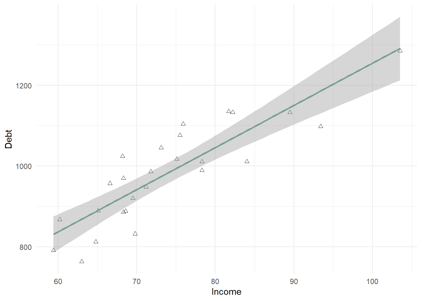
In the above plot, there is a strong positive relationship (upward trend) that should be confirmed with a correlation test.
In a second example below, we look at Unemployment as the X variable. This scatterplot is much more difficult to use in determining whether the correlation will be significant. It looks negative, but there is not a strong linear trend to the data. This will also need to be confirmed with a correlation test.
Debt_Payments %>%
    ggplot(aes(Unemployment, Debt)) + geom_point(color = "#183028", shape = 2) +
    stat_smooth(method = "lm", color = "#789F90") + theme_minimal()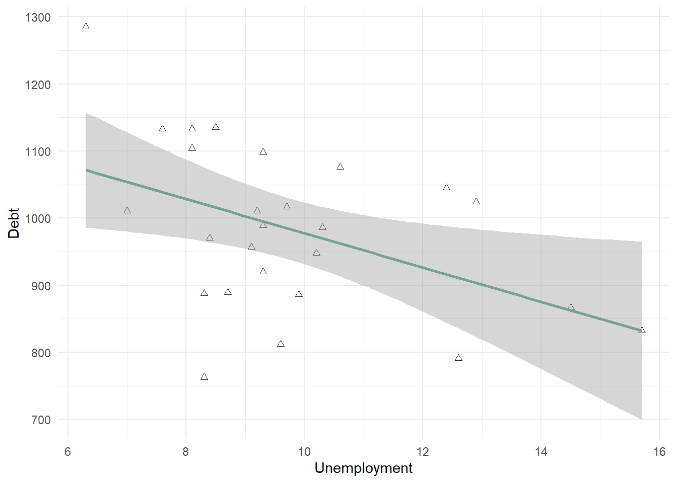
- In many scatterplots using big data, the observations are too numerous to see a good relationship. In that case, the statistical test can trump this visual aid. However, in a lot of cases the scatterplot does help visualize the relationship between 2 continuous variables.
Interpreting the Strength of the Correlation
- Statisticians differ on what is called a strong correlation versus weak correlation, and it depends on the context. A .9 may be required for a strong correlation in one field, and a .5 in another. Generally speaking in business, the absolute value of a correlation .8 or above is considered strong, between .5 and .8 is considered moderate, and between a .2 and .5 is considered weak.
- The following is consistent with what is most generally used:

Interpreting the Significance of the Correlation
- Correlation values should be tested alongside a p-value to confirm whether or not there is a correlation. The null is tested using a t-distribution specifically testing whether \(r = 0\) or not, like the one-sample t-test section from the lesson 6.
- The null and alternative are listed below.
- \(H_0\): There is no relationship between the two variables (\(r = 0\)).
- \(H_A\): There is a relationship between the two variables (\(r \neq 0\)).
- Even small correlations can be significant: In large datasets, even a small correlation, like .1, can be statistically significant due to the increased power that comes with a high sample size. It’s important to interpret both the strength of the correlation and its practical significance in context.
Statistical significance answers the question: “Is the effect real?“
Statistical Significance:
A result is statistically significant if it is unlikely to have occurred by random chance, given a pre-defined threshold (usually p < 0.05).
With larger sample sizes, even very small effects can become statistically significant because larger samples reduce variability. For example, a correlation of 0.1 can be statistically significant with enough data.
Practical Significance:
Practical significance answers the question: “Is the effect meaningful?“
Practical significance refers to the real-world importance or relevance of a result. It asks, “Does this effect matter in practice?“
Even if a result is statistically significant, it may not be large enough to have a meaningful impact on business decisions or outcomes.
cor.test() Command
- The cor() command gives you just the correlation coefficient. This command can be useful if you are testing many correlations at one time. In the below statement, I can use \(cor(Variable1, Variable2)\) to see the correlation between 2 continuous variables.
cor(Debt_Payments$Income, Debt_Payments$Debt)[1] 0.8675115- The cor.test() command tests the hypothesis whether \(r=0\) or not. This command comes with a p-value and t-test statistic (along with the correlation coefficient).
cor.test(Debt_Payments$Income, Debt_Payments$Debt)
    Pearson's product-moment correlation

data:  Debt_Payments$Income and Debt_Payments$Debt
t = 8.544, df = 24, p-value = 9.66e-09
alternative hypothesis: true correlation is not equal to 0
95 percent confidence interval:
 0.7231671 0.9392464
sample estimates:
      cor
0.8675115 - This test shows a strong positive correlation of .8675 (>.8) which is significant. Our p-value is 9.66e-09 or < .001 alpha level. This suggests that we reject the null hypothesis and support the alternative that \(r \neq 0\) which confirms a correlation is present.
- We also see a confidence interval listed. It suggests that we are 95% confident that the correlation is between .723 and .939.
cor.test(Debt_Payments$Income, Debt_Payments$Unemployment)
    Pearson's product-moment correlation

data:  Debt_Payments$Income and Debt_Payments$Unemployment
t = -3.0965, df = 24, p-value = 0.004928
alternative hypothesis: true correlation is not equal to 0
95 percent confidence interval:
 -0.7636089 -0.1852883
sample estimates:
       cor
-0.5342931 - This test shows a moderate negative correlation of -.534 (<.5 and .8) which is significant. Our p-value is 0.004928 or < .01 alpha level. This suggests that we reject the null hypothesis and support the alternative that \(r \neq 0\) which confirms a correlation is present.
- We also see a confidence interval listed. It suggests that we are 95% confident that the correlation is between -.765 and -.185. This confidence interval is wider than the one listed above. This is due to the noise in the relationship we noted in the scatterplot - the correlation is weaker, the relationship does not look as linear, the confidence decreases. Even though this is true, we must note that we still found a significant correlation.
Additional Examples
library(ISLR)
data("Credit")
summary(Credit)
ID Income Limit Rating
Min. : 1.0 Min. : 10.35 Min. : 855 Min. : 93.0
1st Qu.:100.8 1st Qu.: 21.01 1st Qu.: 3088 1st Qu.:247.2
Median :200.5 Median : 33.12 Median : 4622 Median :344.0
Mean :200.5 Mean : 45.22 Mean : 4736 Mean :354.9
3rd Qu.:300.2 3rd Qu.: 57.47 3rd Qu.: 5873 3rd Qu.:437.2
Max. :400.0 Max. :186.63 Max. :13913 Max. :982.0
Cards Age Education Gender Student
Min. :1.000 Min. :23.00 Min. : 5.00 Male :193 No :360
1st Qu.:2.000 1st Qu.:41.75 1st Qu.:11.00 Female:207 Yes: 40
Median :3.000 Median :56.00 Median :14.00
Mean :2.958 Mean :55.67 Mean :13.45
3rd Qu.:4.000 3rd Qu.:70.00 3rd Qu.:16.00
Max. :9.000 Max. :98.00 Max. :20.00
Married Ethnicity Balance
No :155 African American: 99 Min. : 0.00
Yes:245 Asian :102 1st Qu.: 68.75
Caucasian :199 Median : 459.50
Mean : 520.01
3rd Qu.: 863.00
Max. :1999.00 attach(Credit)
cor.test(Rating, Income) #0.7913776 moderate and positive
    Pearson's product-moment correlation

data:  Rating and Income
t = 25.826, df = 398, p-value < 2.2e-16
alternative hypothesis: true correlation is not equal to 0
95 percent confidence interval:
 0.751651 0.825383
sample estimates:
      cor
0.7913776 cor.test(Rating, Balance) #0.8636252 strong and positive
    Pearson's product-moment correlation

data:  Rating and Balance
t = 34.176, df = 398, p-value < 2.2e-16
alternative hypothesis: true correlation is not equal to 0
95 percent confidence interval:
 0.8363997 0.8865997
sample estimates:
      cor
0.8636252 cor.test(Rating, Limit) #0.9968797 strong and positive
    Pearson's product-moment correlation

data:  Rating and Limit
t = 251.95, df = 398, p-value < 2.2e-16
alternative hypothesis: true correlation is not equal to 0
95 percent confidence interval:
 0.9962026 0.9974363
sample estimates:
      cor
0.9968797
## almost perfectly linear
ggplot(Credit, aes(Rating, Limit)) + geom_point()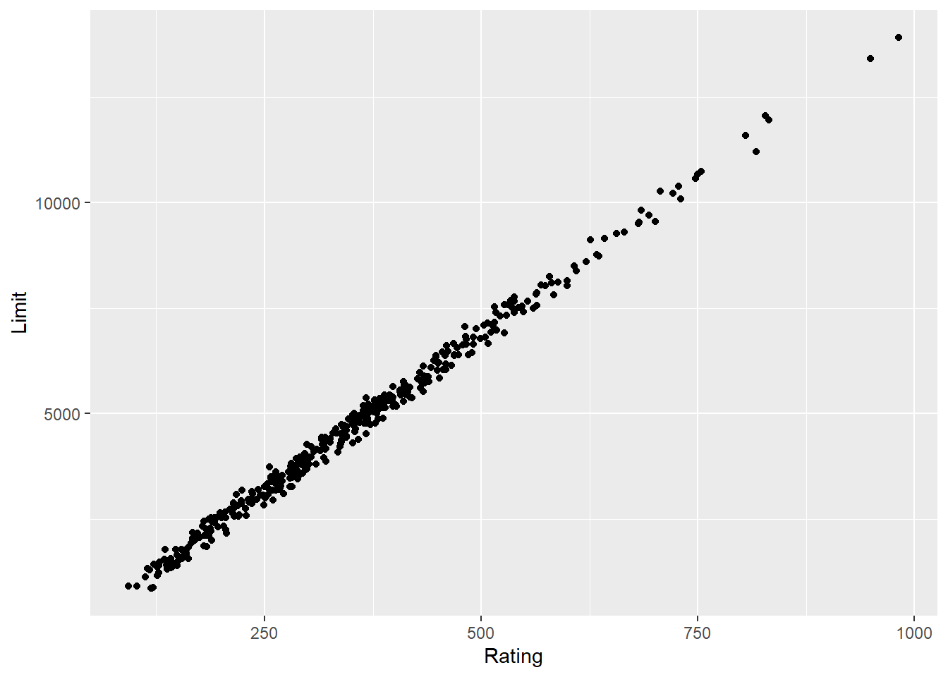
cor.test(Rating, Education) #-0.03013563 no correlation
    Pearson's product-moment correlation

data:  Rating and Education
t = -0.60148, df = 398, p-value = 0.5479
alternative hypothesis: true correlation is not equal to 0
95 percent confidence interval:
 -0.12780969  0.06811737
sample estimates:
        cor
-0.03013563 cor.test(Rating, Age) #0.103165 - between -.2 and .2 - so no relationship even though p-value < .05 -- p-value fails at .01 level.
    Pearson's product-moment correlation

data:  Rating and Age
t = 2.0692, df = 398, p-value = 0.03917
alternative hypothesis: true correlation is not equal to 0
95 percent confidence interval:
 0.005165528 0.199201690
sample estimates:
     cor
0.103165 ggplot(Credit, aes(Rating, Age)) + geom_point() + stat_smooth(method = "lm")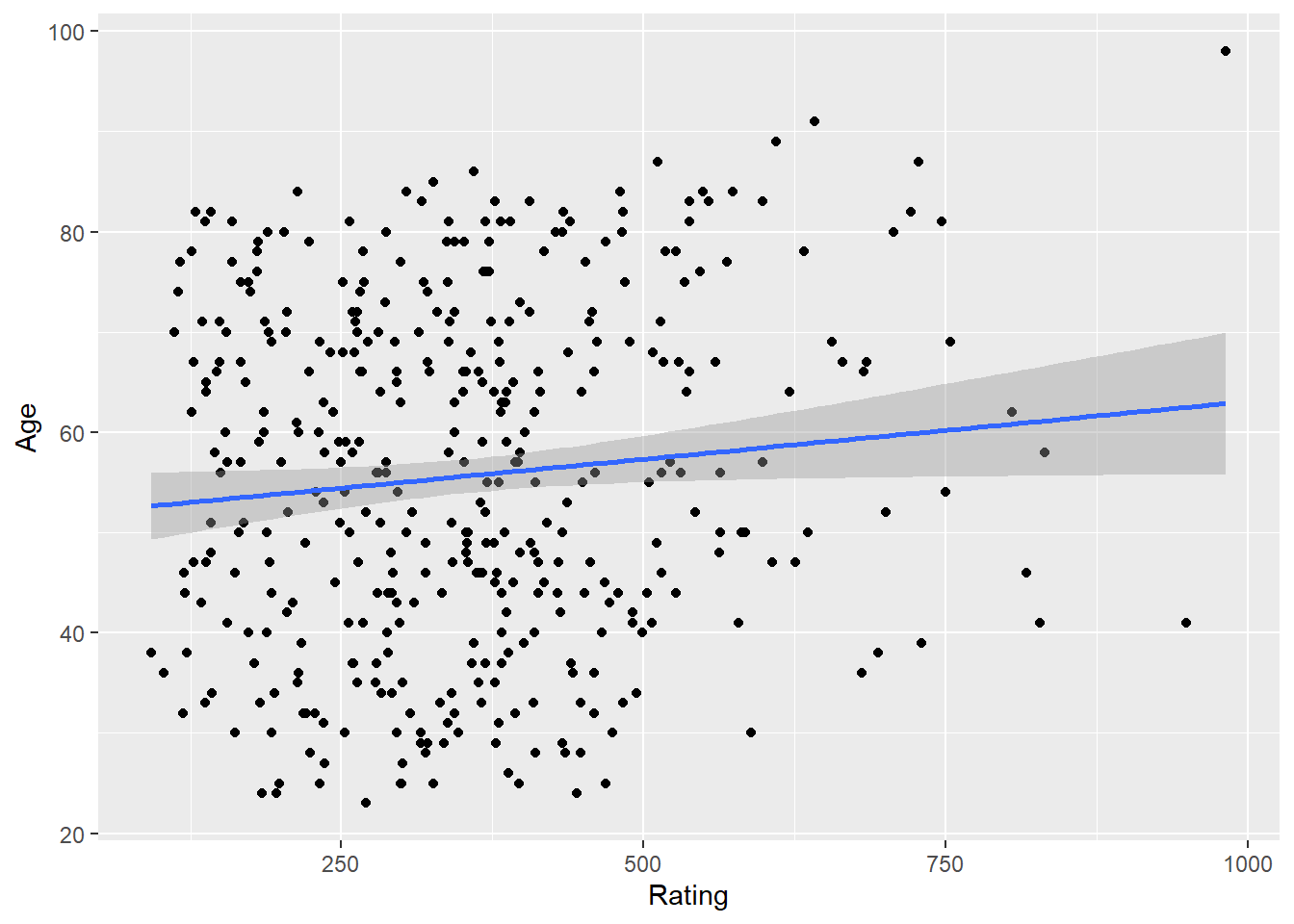
cor.test(Rating, Cards) #0.05323903
    Pearson's product-moment correlation

data:  Rating and Cards
t = 1.0636, df = 398, p-value = 0.2881
alternative hypothesis: true correlation is not equal to 0
95 percent confidence interval:
 -0.04504785  0.15050509
sample estimates:
       cor
0.05323903 ggplot(Credit, aes(Rating, Cards)) + geom_point() + stat_smooth(method = "lm")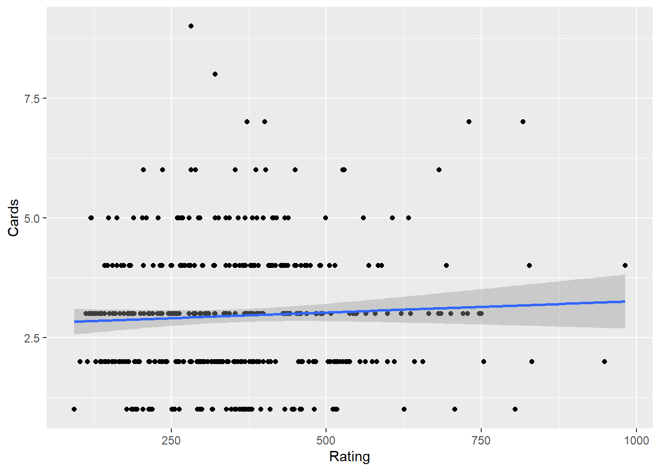
Comparing to t.test and ANOVA
- A t-test examines if there is a significant difference in the means of two groups on a dependent variable. For example, whether males and females differ in their credit ratings, where a correlation measures the strength and direction of a linear relationship between two continuous variables, such as Rating and Income.
- An independent t-test requires a categorical independent variable (e.g., Gender) with two levels and a continuous dependent variable (e.g., Rating), where a correlation requires two continuous variables.
- Both can provide insights into relationships in the dataset, but they address different questions. An independent t-test evaluates mean differences (group comparisons), while correlation evaluates relationships (continuous covariation). * A significant t-test does not imply a strong correlation between the grouping variable and the dependent variable; the correlation would depend on the coding of the categorical variable and the distribution of data
## -- Example of an independent t.test using same dataset
t.test(Rating ~ Gender, data = Credit)  ##no group differences
    Welch Two Sample t-test

data:  Rating by Gender
t = -0.17703, df = 393.54, p-value = 0.8596
alternative hypothesis: true difference in means between group  Male and group Female is not equal to 0
95 percent confidence interval:
 -33.26095  27.76582
sample estimates:
 mean in group  Male mean in group Female
353.5181 356.2657 ggplot(Credit, aes(Gender, Rating)) + geom_boxplot()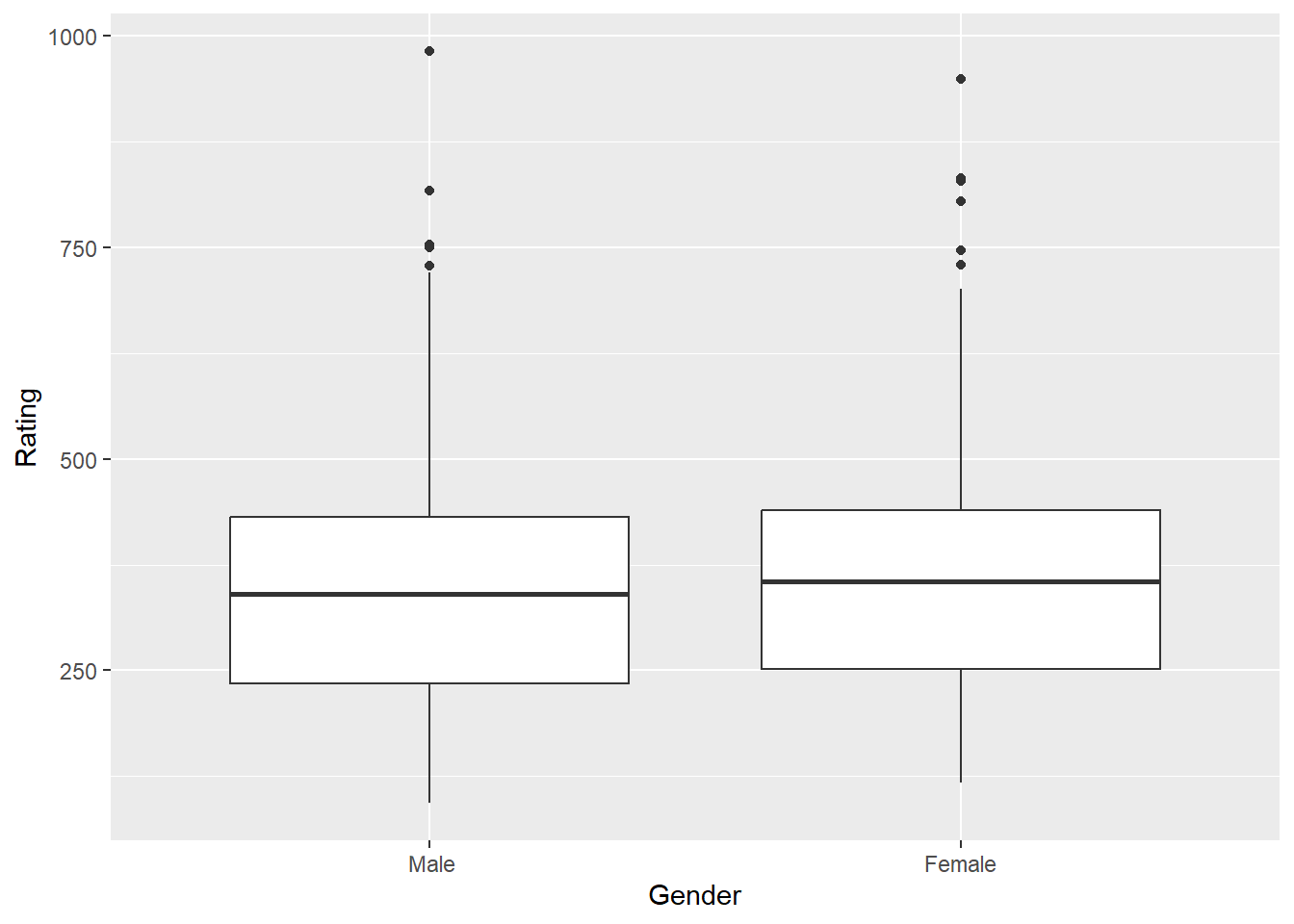
t.test(Rating ~ Married, data = Credit) ##no group differences
    Welch Two Sample t-test

data:  Rating by Married
t = -0.74241, df = 340.4, p-value = 0.4584
alternative hypothesis: true difference in means between group No and group Yes is not equal to 0
95 percent confidence interval:
 -42.54190  19.22762
sample estimates:
 mean in group No mean in group Yes
347.8000 359.4571 ggplot(Credit, aes(Married, Rating)) + geom_boxplot()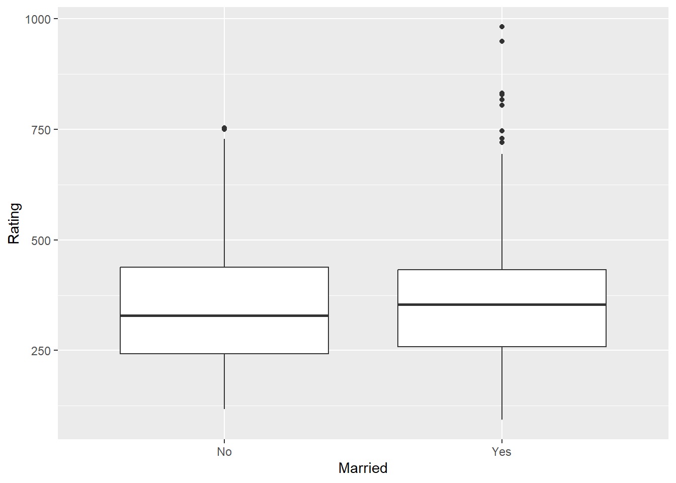
- An ANOVA tests for significant differences in the means of three or more groups on a dependent variable. For example, whether credit ratings differ across ethnic groups, where a correlation examines the strength of the relationship between two continuous variables.
- An Anova requires a categorical independent variable (with three or more levels) and a continuous dependent variable, where a correlation requires two continuous variables.
- ANOVA focuses on group comparisons (e.g., Rating differences across Ethnicity), while correlation looks at how two variables change together.A significant ANOVA could suggest that the categorical grouping variable explains some variance in the dependent variable, but this variance is not quantified as a relationship strength (as correlation would provide).
## -- Example of An ANOVA using same dataset
anova1 <- aov(Rating ~ Ethnicity, data = Credit)
anova(anova1)  #no group differences - no need for a post hoc test.
Analysis of Variance Table
Response: Rating
Df Sum Sq Mean Sq F value Pr(>F)
Ethnicity 2 19388 9694.1 0.4037 0.6681
Residuals 397 9532496 24011.3 ggplot(Credit, aes(Ethnicity, Rating, fill = Ethnicity)) + geom_boxplot(show.legend = FALSE)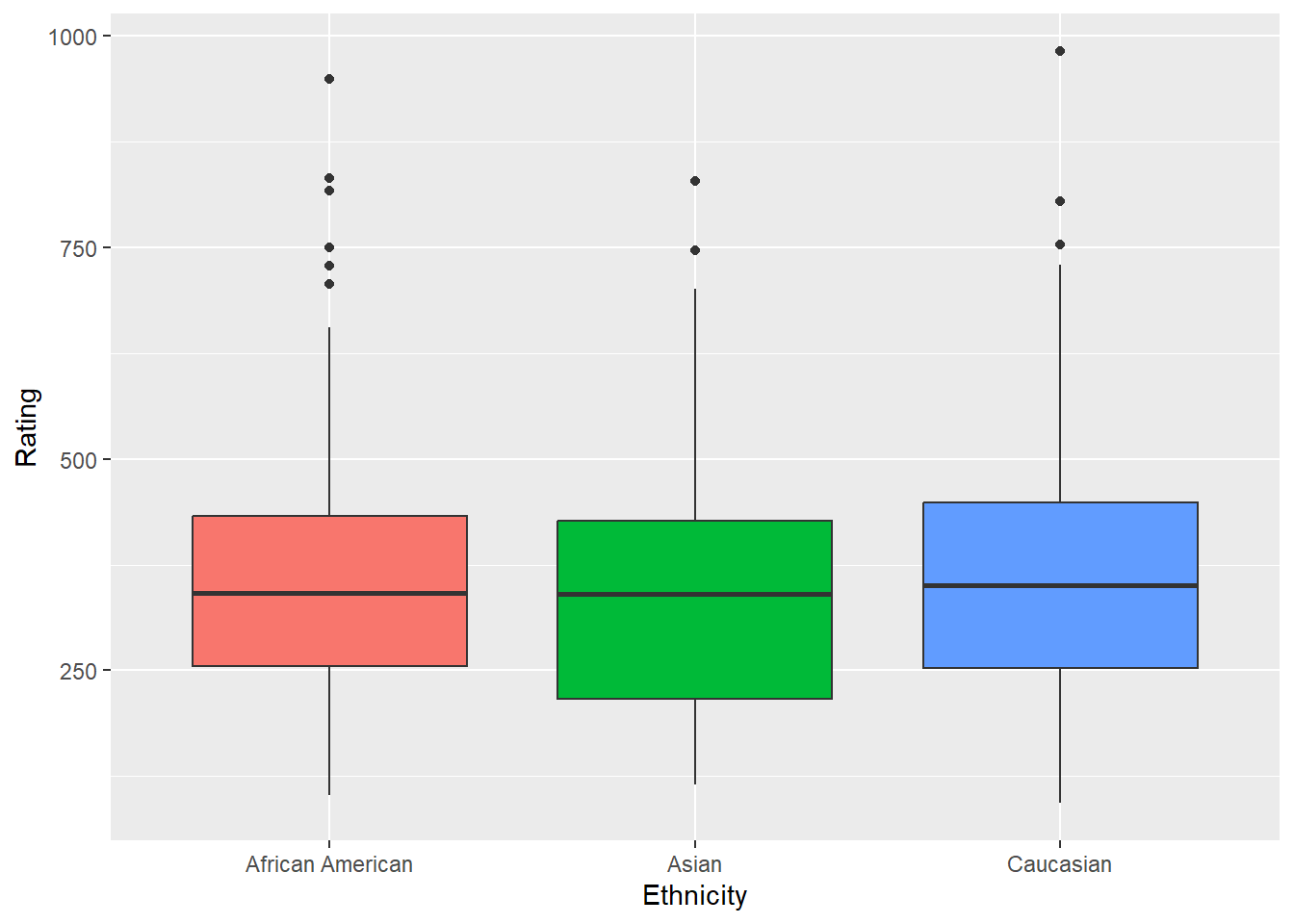
Limitations of Correlation Analysis
Note that a correlation is the first step in understanding causality. Correlation and causality are closely related but fundamentally different concepts in data analysis. Correlation refers to the statistical relationship between two variables, indicating how changes in one variable are associated with changes in another. However, it does not imply that one variable causes the other to change. Causality, on the other hand, goes beyond mere association to establish a cause-and-effect relationship, where one variable directly influences the other. Determining causality requires meeting specific criteria, including significant association, temporal precedence (the cause precedes the effect), and ruling out alternative explanations or confounding variables. While correlation is often the first step in exploring potential relationships, additional analysis—such as experimental design or causal modeling—is necessary to confirm causality. This distinction highlights the importance of critical thinking when interpreting statistical results, as a strong correlation alone does not prove that one variable is the cause of another.
To determine a causal model, you need the following:
- Significant Correlation: Statistically significant relationship between the variables.
- Temporal Precedence: Causal variable occurred prior to the other variable.
- Eliminate Alternate Variables: No other factors can account for the cause.
- Some limitations are as follows:
- The correlation coefficient captures only a linear relationship.
- The correlation coefficient may not be a reliable measure in the presence of outliers.
- Even if two variables are highly correlated, one does not necessarily cause the other.
- When interpreting results, note that lack of significance does not mean a variable X has no relationship with Y; it might suggest a more complex or non-linear relationship.
Using AI
Use the following prompt on a generative AI, like chatGPT, to learn more about correlation analysis.
Explain the difference between covariance and correlation. How do you interpret the direction and strength of a correlation coefficient?”
What is covariance, and how does it describe the relationship between two variables? Provide an example with a simple dataset. Describe Pearson’s correlation coefficient. How do you calculate it, and what does it tell you about the relationship between two variables?
Explain how to create a scatterplot using ggplot2 in R to visualize the relationship between two continuous variables. How can you add a regression line to assess the linearity of the relationship?
How can you use the cor.test() function in R to conduct a hypothesis test for correlation? What do the p-value and confidence interval indicate in the context of correlation?
How do you interpret the strength and direction of a correlation? What is considered a strong, moderate, or weak correlation in the context of business data?
Explain the null and alternative hypotheses for correlation testing. How does the t-distribution play a role in testing the significance of a correlation coefficient?
What are some challenges of visualizing relationships between variables when dealing with big data, and how can statistical tests help when scatterplots are not effective?
Discuss the limitations of correlation analysis. Why is it important to be cautious when interpreting correlation as causation?
What are the key differences between correlation and causation? How can you determine if a correlation implies causality?
Summary
- In this lesson, we learned about correlation coefficient and how to evaluate a strong, moderate, or weak/positive or negative correlation. We also learned how to visualize a relationship using a scatterplot. We also learned how to test for a correlation being significant or not.